Why Your Jewelry Photos Look Flat (And the Lighting Fix That Changes Everything)
My mom used to sell handmade earrings on Etsy. She was taking photos on her iPhone in her kitchen, overhead fluorescent light, white paper plate as a background. The earrings were genuinely beautiful. The photos looked like evidence photos. She was selling maybe two or three pairs a month, and she couldn’t figure out why.
I rebuilt her setup in an afternoon. Nothing expensive. A $30 lightbox from Amazon, one foam core bounce card, and her existing phone. Within three months her sales had tripled. The earrings didn’t change. The light did.
That experience is why I spend so much time teaching jewelry lighting specifically. It’s the category where bad light does the most damage, and where good light creates the biggest return.
Why Jewelry Kills Cameras (Technically Speaking)
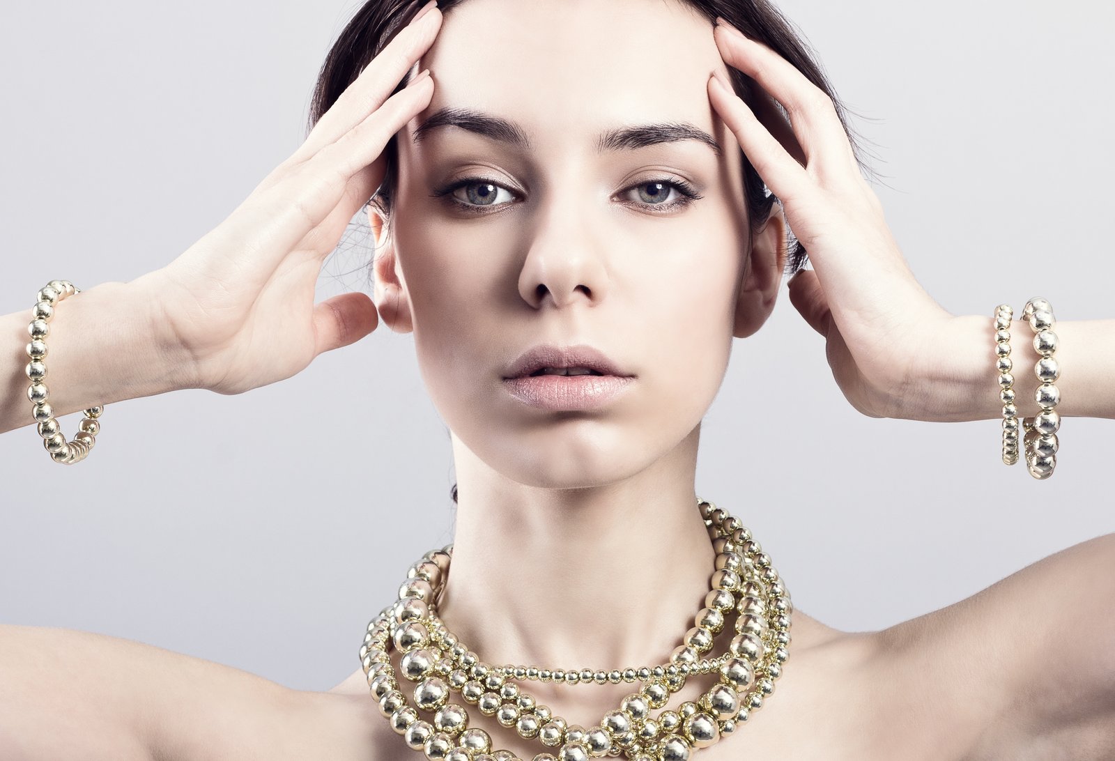
The problem with jewelry isn’t that it’s small. The problem is that it’s reflective, specular, and often transparent or translucent all at once. Metal reflects the entire environment around it. Gemstones refract and bend light internally. Pearls and opals scatter it. Your camera sensor has to handle an enormous dynamic range in a single frame, from the near-white of a polished silver band to the deep shadow inside a stone setting, sometimes within a centimeter of each other.
When light is diffuse and directionless, like overhead fluorescent, the metal reads as flat gray. The stones lose their depth. Nothing sparkles because sparkle requires a specular highlight, which requires a defined light source hitting at the right angle.
Your camera isn’t failing. Your light source is the wrong tool for the material.
The Two-Light Setup That Actually Works
I shoot most of my jewelry with two lights: one primary softbox and one smaller, harder accent light. The softbox does the heavy lifting. I use a 24x24 inch softbox positioned at about 45 degrees above and to the left of the piece, roughly 18 inches away. This gives me the overall exposure and wraps light around curved surfaces without blowing out the entire piece.
The accent light is where the magic happens. I use a gridded strip light, or sometimes just a small speedlight with a 1/4-inch diffusion sheet taped over it, positioned low and to the right, almost level with the jewelry. This skims light across the surface and creates the micro-shadows that show texture, and it’s also what makes metal look like metal instead of plastic.
Ratio-wise, my primary is at full power and my accent runs at about 1/4 or 1/3 of that. You want it contributing, not competing.
For camera settings, I shoot at f/11 minimum. Depth of field is brutal with jewelry close-ups. At f/8 you can have the front of a ring in focus and the back completely soft, which reads as a technical error to buyers. ISO stays at 100. Shutter syncs to flash, typically 1/125. I always shoot tethered to my laptop so I can see exactly where the highlights are landing before I commit to 40 frames of the same angle.
The Reflector Trick Nobody Talks About
Here’s something I figured out by accident: white foam core placed directly opposite your main light, as close to the jewelry as you can get it without entering the frame, does more work than a second expensive light source. It bounces fill light back into the shadow side of a piece with enough softness that it looks natural, not like you lit it from both sides equally, which tends to flatten everything out again.
For rings and bracelets especially, I’ll sometimes cut a small square of foam core and place it inside a ring just out of frame. It bounces light up through the inside of the band and kills that dead black shadow that makes rings look hollow.
This is the kind of thing you only learn by shooting in a lightbox in your kitchen at 11pm, which, yes, I do regularly. The kitchen counter is stable, the controlled environment makes variables easy to isolate, and honestly the close proximity to snacks helps.
Background Choice Is a Lighting Decision
Most people treat background as an aesthetic choice. It’s also a technical one. A bright white background at pure white (#ffffff) requires more light pointed at the background itself, which bleeds onto your subject and raises your ambient light level, creating exactly the kind of flat, directionless exposure we’re trying to avoid.
I shoot jewelry on mid-gray more often than white because it gives me more control. I can push it to white in post in about 30 seconds using a levels adjustment in Lightroom. Starting with white and trying to separate a silver necklace from a blown-out background is a much harder problem to fix.
For clients who need lifestyle-adjacent shots, I use dark textured surfaces, matte black foam board, slate, or dark linen fabric because high-contrast backgrounds let the jewelry read first. The rule I follow: light jewelry on dark, dark jewelry on light, and always check that the background doesn’t share a similar tone to the main material.
The File You Send Matters as Much as the Shot You Take
After all that work, I see photographers export at whatever Photoshop defaulted to. For e-commerce, you want JPEGs at 72 DPI for web display but sized at a minimum of 1500 pixels on the longest side, ideally 2000 or more. Shopify, Etsy, and Amazon all zoom on hover, and nothing destroys the credibility of a well-lit shot faster than a pixelated zoom view. I export at sRGB color profile for consistent rendering across devices. If you’re shooting RAW, which you should be, check that your export profile isn’t set to Adobe RGB, because it will look oversaturated on most monitors and muted on others.
A great photo that exports wrong still fails the customer.
The single most important thing I can tell you about jewelry photography is this: the light has to have a source your eye can track. If you can look at a finished image and not tell where the light came from, you’ve diffused everything into flatness, and no amount of post-processing will put the sparkle back.