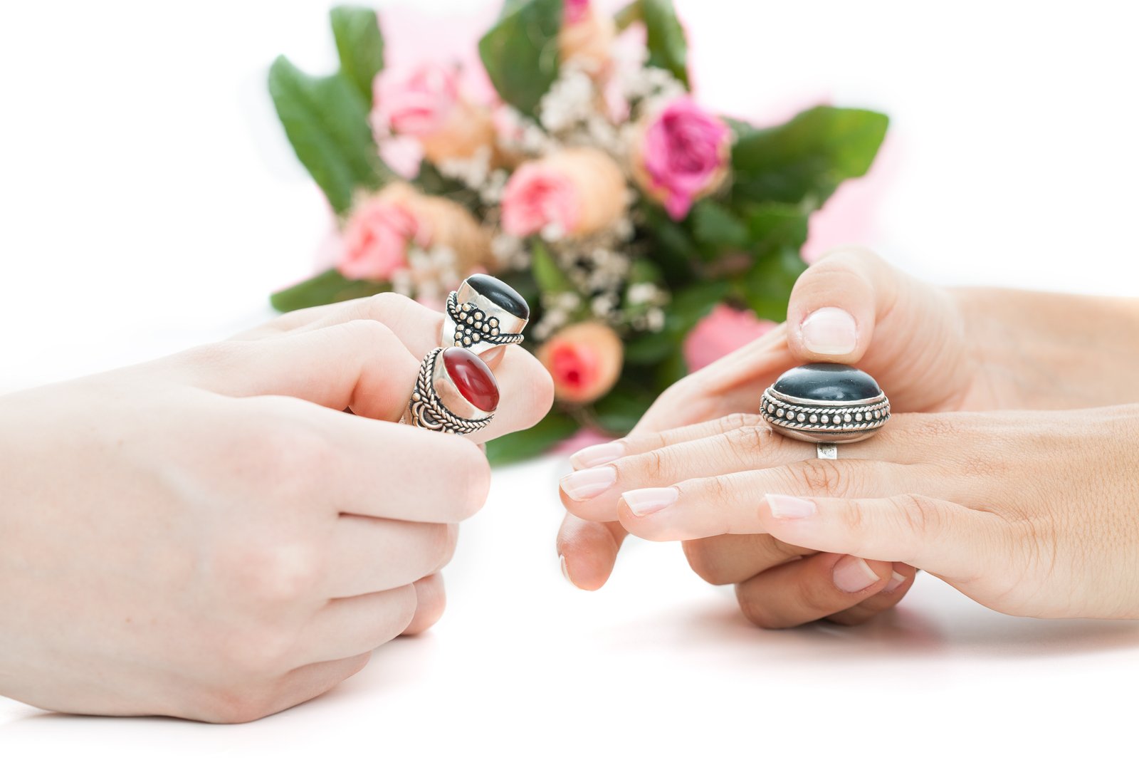
Why Your Jewelry Photos Look Dull (And the Lighting Fix That Changed Everything)
The Problem Isn’t Your Camera
A few years ago, my mom was selling handmade silver earrings on Etsy. She’d photograph them on her kitchen counter with her iPhone, natural light coming through the window, and wonder why nobody was clicking. The earrings were genuinely beautiful. The photos made them look like props from a garage sale. I stepped in, rebuilt her setup from scratch, and her sales tripled within two months. The earrings didn’t change. The light did.
Jewelry is the most technically demanding category in product photography, and most people don’t realize it until they’re staring at a photo of a necklace that looks like a gray blob. The problem is almost never the camera.
Why Metal and Gemstones Break Every Normal Rule
Standard product photography advice, shoot in soft diffused light, bounced flash, large light source, works beautifully for clothing, ceramics, and packaging. Apply that same logic to a polished silver ring and you get a washed-out, characterless surface with zero depth.
Here’s what’s actually happening: specular reflection. Polished metal and faceted gemstones don’t scatter light the way matte surfaces do. They act like tiny mirrors. Whatever is in the environment gets reflected directly back into your lens. Shoot near a window with a white wall behind you, and your ring will reflect a blown-out white smear where there should be sparkle and dimension.
The fix requires two things working together: a controlled light source and a controlled environment. You need to introduce just enough reflection to create life in the metal, while eliminating every unwanted element that would otherwise appear in the surface.
The Tent-and-Flag Setup That Actually Works
I shoot most of my jewelry inside a 16-inch collapsible light tent (the Neewer version runs about $25 on Amazon) with one key modification. I cut a 4x6-inch black card, a “flag,” and tape it to the inside of the tent directly opposite my lens. That black card reflects back into the metal and creates a dark gradient that gives rings and chains their three-dimensional edge definition. Without it, everything collapses into a bright, flat oval.
For lighting, I use two LED panel lights, the Neewer 660 LEDs, positioned at roughly 45 degrees to either side of the tent at about 18 inches back. Both set to 5600K daylight. Power ratio: the key light at about 75 percent, fill at 40 percent. That slight imbalance creates shadow depth without going dramatic.
For gemstones specifically, rubies, sapphires, amethysts, I’ll add a third light source directly behind the piece at a low angle. Even a cheap fiber optic light (Fotodiox makes one for around $60) aimed through the tent fabric from behind will fire up the interior of a faceted stone in a way that no front-facing light ever can. The physics of it: you’re catching total internal reflection inside the stone, which is what produces that lit-from-within glow that makes customers stop scrolling.
Camera settings: I shoot on a Sony A7III with a 90mm macro lens, but the settings matter more than the body. Aperture at f/11 for edge-to-edge sharpness, ISO 100 to keep noise out of the shadows, and a two-second self-timer or a remote shutter to eliminate any camera shake. Shutter speed adjusts to exposure, usually around 1/30 at these power levels.
Surfaces and Backgrounds Are Half the Shot
White seamless card stock is the default, and it’s fine. But it’s not always right. For silver and white gold pieces, I switch to a light gray card (Savage Gray is a standard option) because true white can visually compete with highly reflective metal. For gold and brass pieces, I’ll sometimes use a very light warm gray or even a sheet of frosted acrylic to add subtle warmth without color-casting.
Black velvet is popular for jewelry displays in stores, but it’s a nightmare to photograph. Velvet collects dust and lint that become extremely visible in macro work, and it creates exposure challenges that push most cameras into overcompensating on the bright metal areas. If a client insists on black, I use matte black card stock instead and flag my lights aggressively to keep reflections controlled.
One thing I test every single time: the sweep. The background should curve behind the product with no visible horizon line. I tape the card to the back wall of the tent and let it flow forward under the piece. Any crease or bend in that card will show up in your shot as a shadow line running across the background, and it reads as unprofessional even when viewers can’t name exactly why something looks off.
Editing for Jewelry Without Destroying the Sparkle
My Lightroom baseline for jewelry: whites at plus 20, highlights at minus 30, clarity at plus 10. That last one is counterintuitive. Clarity adds midtone contrast, and in metal, that contrast is what separates a professional shot from a flat one. I do not touch saturation on a global level. Instead, I go into HSL and adjust individual color channels, pulling back yellow if gold is reading too orange, nudging blue if a sapphire is going violet on screen.
For gemstones, I always run a sharpening pass in Photoshop using the High Pass filter at around 2.5 pixels, blended in Overlay mode. It brings out the facet edges without introducing the crunchy artifact look you get from over-sharpening in Lightroom’s Detail panel.
File output for e-commerce: 2000x2000 pixels minimum, sRGB color space, saved as JPEG at quality level 9 (not maximum, 9 gives you a clean compression without the unnecessary file bloat). Most platforms including Shopify and Etsy handle that size comfortably and it leaves room for customers to zoom.
The single most important thing I can tell you about jewelry photography is this: light control is everything, and the black flag inside your tent will do more for your metal shots than any camera upgrade you’re considering.