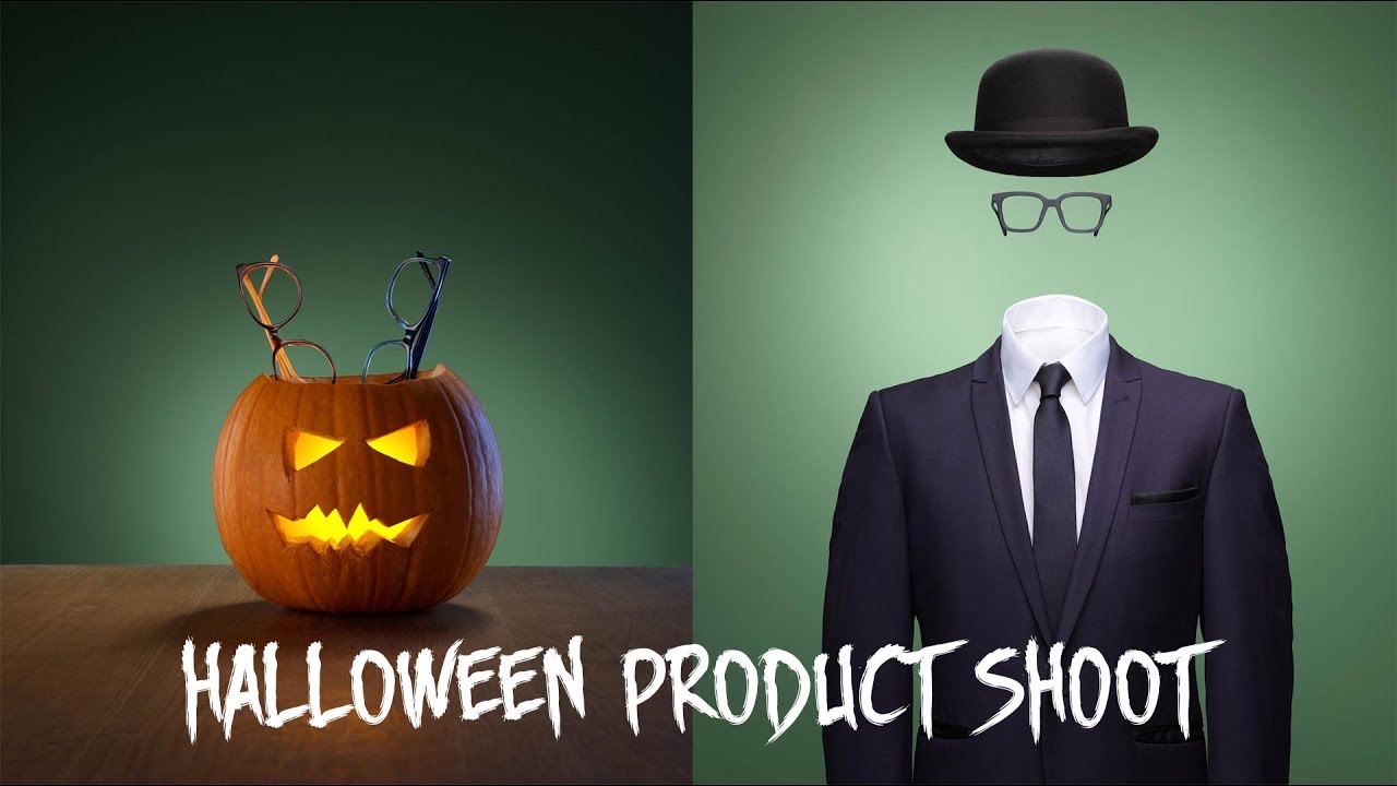
Why Your Halloween Product Shot Needs More Lights Than You Think (A Breakdown of an 8-Light Setup)
Every few months a client sends me a reference image and says, “can you do something like this?” And every time, what they’ve sent me is a shot that looks effortless but is actually hiding a lot of infrastructure. That was exactly my reaction watching Visual Education’s Halloween product shoot tutorial, where photographer and educator Karl Taylor walks through two completely different setups from the same shooting session. Watch the full tutorial on YouTube — it’s short, but dense with useful thinking.
What hooked me wasn’t the Halloween theme. It was the framing of the central question: how many lights do you actually need? I hear this constantly from the small business owners I teach. They assume more lights means overcomplicating things, or that pros use fewer lights because they’re more skilled. This tutorial dismantles that assumption cleanly. The pumpkin shoot required eight lights. Not because the photographer reached for every modifier in the kit, but because each light was solving a specific visual problem that the previous light couldn’t fix alone.
I want to walk through the logic of this setup step by step, because the sequencing matters as much as the gear list. This is how experienced photographers build a shot. Not by planning all eight lights from the start, but by adding one at a time until the image tells you it’s done.
Step 1: Solve the core concept first — light from the inside out
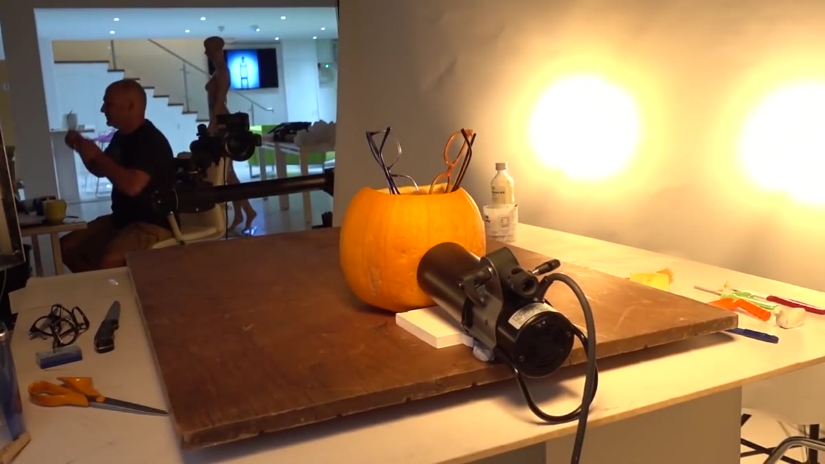
 Orange glow visible through carved pumpkin from behind
Before a single strobe fires at the subject, the pumpkin’s internal glow had to exist. A hole was cut in the back of the pumpkin and a light was placed inside, gelled with an orange filter and diffusion material to soften the color. This is your hero element — the thing that sells the Halloween concept in a single frame.
Orange glow visible through carved pumpkin from behind
Before a single strobe fires at the subject, the pumpkin’s internal glow had to exist. A hole was cut in the back of the pumpkin and a light was placed inside, gelled with an orange filter and diffusion material to soften the color. This is your hero element — the thing that sells the Halloween concept in a single frame.
The lesson here is concept-first lighting. If the image has a narrative (a lit jack-o-lantern, a glowing bottle, a candle-lit scene), that narrative needs its own dedicated light source before you layer anything else. Trying to fake an internal glow with external lights is a shortcut that always reads as flat. Commit to the concept, build the light around it.
Step 2: Build the primary subject light with a scrim
 Two lights aimed at pumpkin through scrim roll diffusion panel
Two lights were aimed at the pumpkin through a scrim roll, a large panel of diffusion material that acts like a giant softbox when you backlight it. This combination served double duty: shaping the pumpkin’s outer surface and illuminating any product items placed inside or around it.
Two lights aimed at pumpkin through scrim roll diffusion panel
Two lights were aimed at the pumpkin through a scrim roll, a large panel of diffusion material that acts like a giant softbox when you backlight it. This combination served double duty: shaping the pumpkin’s outer surface and illuminating any product items placed inside or around it.
A scrim gives you control over the size and softness of your light source without committing to a fixed softbox shape. If you don’t have a dedicated scrim frame, a sheet of ripstop nylon or even tracing paper stretched across a simple PVC frame will do the same job. Two lights behind it lets you balance the output across the full surface instead of getting a hot spot in the center.
Step 3: Add an edge light to define the form
 Single light positioned at rear edge of pumpkin for rim lighting
A single light placed behind and to the side of the pumpkin created a rim along its edge. This is the step that makes a round, orange object look three-dimensional instead of like a flat cutout. Without it, the subject blends into whatever is behind it.
Single light positioned at rear edge of pumpkin for rim lighting
A single light placed behind and to the side of the pumpkin created a rim along its edge. This is the step that makes a round, orange object look three-dimensional instead of like a flat cutout. Without it, the subject blends into whatever is behind it.
For product photography, edge lights are one of the most underused tools in a beginner’s kit. Even a small gridded light or a bare strobe flagged tight will give a product a spine. The placement angle matters more than the power level here. Start at about 45 degrees behind the subject and rotate until you see the edge catch light without spilling onto the lens.
Step 4: Use a gel to build atmosphere, not just color
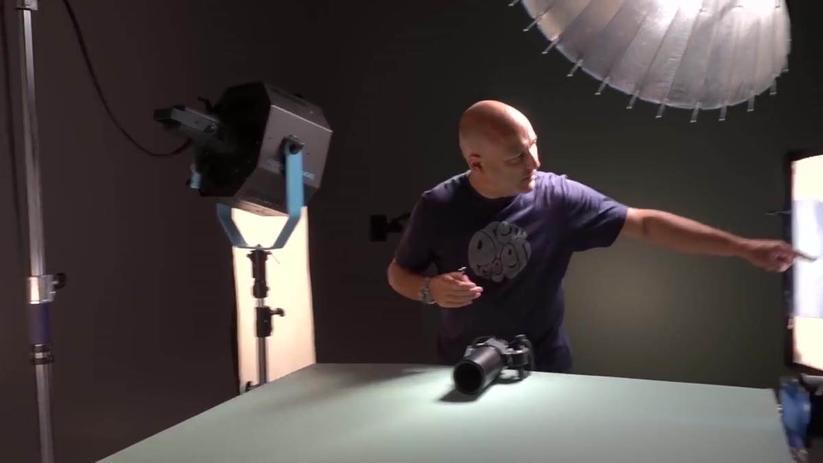 Blue-gelled light creating cool color contrast on pumpkin edge
A second edge light, this one fitted with a blue gel, added a cool color rim on the opposite side of the pumpkin. Paired with the warm orange glow from inside, this created color contrast that reads immediately as moody and cinematic.
Blue-gelled light creating cool color contrast on pumpkin edge
A second edge light, this one fitted with a blue gel, added a cool color rim on the opposite side of the pumpkin. Paired with the warm orange glow from inside, this created color contrast that reads immediately as moody and cinematic.
This is color theory applied directly to lighting. Warm and cool sources on the same subject create visual tension that feels intentional and polished. For e-commerce work, I use this same approach when shooting jewelry or glass products: one warm source, one neutral or cool source, and let the contrast do the heavy lifting. A small fresnel light is ideal for this step because it throws a tight, controllable beam that won’t bleed into your other carefully placed sources.
Step 5: Add a top light for dimension and shadow drama
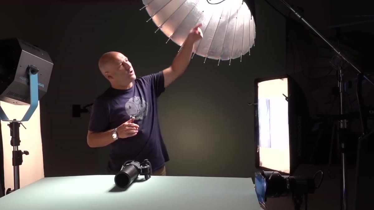 Overhead light casting downward pool of light and subject shadow
A light placed above the scene created a pool of light falling onto the surface below the pumpkin, along with a cast shadow. This grounded the subject in the frame and gave the image a theatrical, almost stage-lit quality.
Overhead light casting downward pool of light and subject shadow
A light placed above the scene created a pool of light falling onto the surface below the pumpkin, along with a cast shadow. This grounded the subject in the frame and gave the image a theatrical, almost stage-lit quality.
Top lights are something I reach for whenever a product feels like it’s floating. A hard top light casts a defined shadow that tells the viewer there’s a surface. A soft top light wraps over the top of the subject and adds gentle dimensionality. The choice depends on how dramatic your concept is. For Halloween, hard made more sense. For a skincare product, soft top light feels more aspirational and clean.
Step 6: Finish with the background light and evaluate the full picture
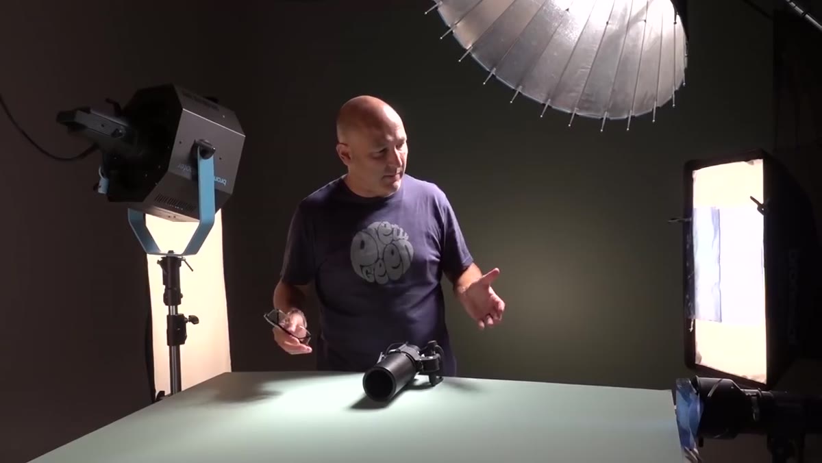
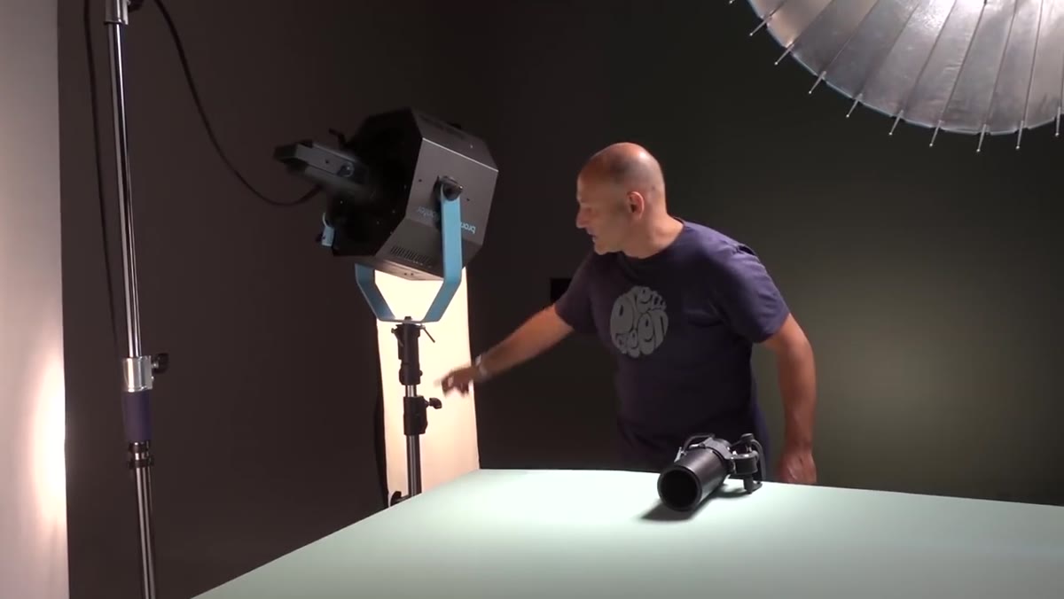
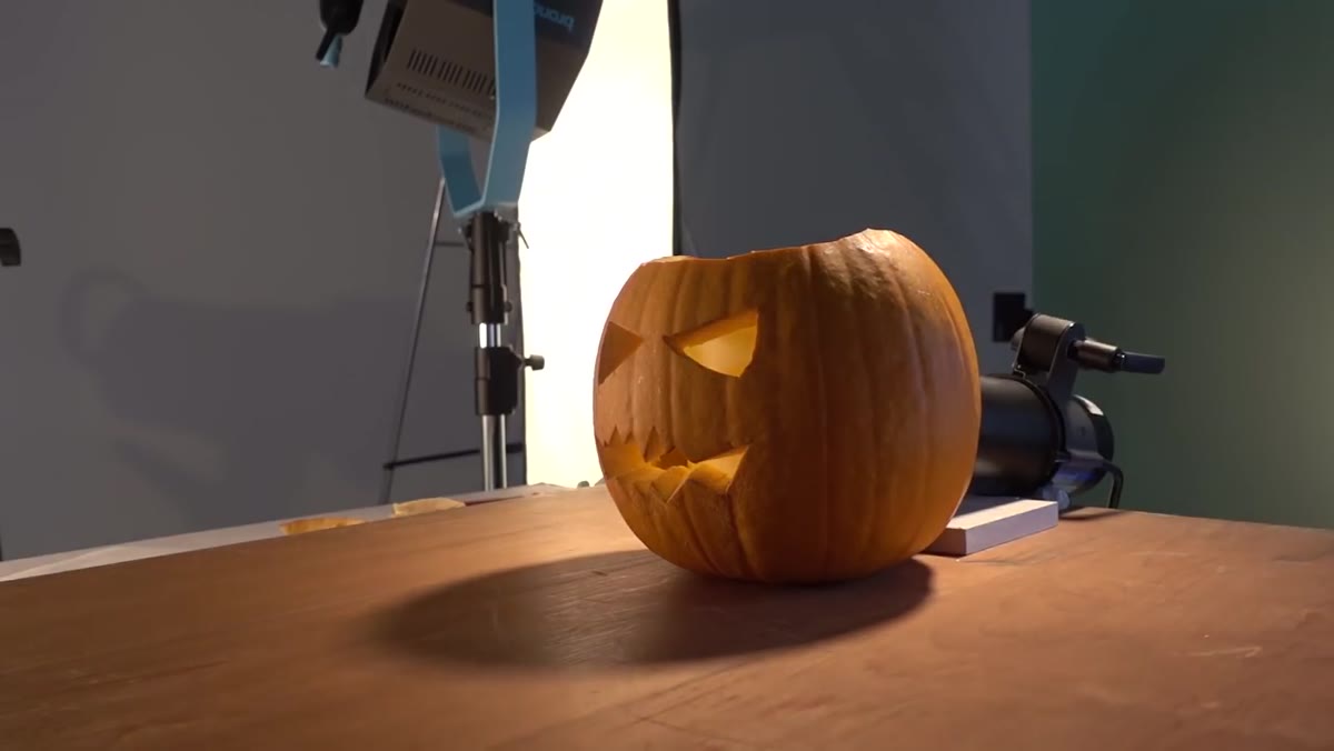 Broncolor flooter pointed at background creating gradient glow
The final light was a flooter aimed at the background to create a soft, even glow behind the entire setup. This gave the image depth, separated the subject from the backdrop, and completed the atmospheric quality of the scene.
Broncolor flooter pointed at background creating gradient glow
The final light was a flooter aimed at the background to create a soft, even glow behind the entire setup. This gave the image depth, separated the subject from the backdrop, and completed the atmospheric quality of the scene.
Background lights are often treated as an afterthought, but they set the overall mood of the image as much as anything pointed at the product. A flooter produces a wide, even spread. If you don’t have one, a bare strobe pointed at a white wall from a distance will approximate the effect. The key is to keep the background slightly darker than the subject so the eye stays on the product, not the backdrop.
What I’d do differently in a smaller studio
Eight lights is a dream scenario, and I’m not shooting with eight Broncolor heads. What this tutorial taught me, though, isn’t a gear list. It’s a methodology. Build from concept outward. Add one light at a time. Ask what problem each new light is solving before you add it.
When I recreate a layered setup like this with limited equipment, I prioritize in the same order: the concept light first, then primary subject illumination, then edge definition, then background. If I run out of lights before I finish the list, I problem-solve with reflectors and flags. A silver reflector placed opposite an edge light can fake a second rim. A black card behind the subject subtracts light and adds the same depth a background gradient would. The sequencing is the skill, not the hardware.
The single most important thing this tutorial reinforced for me: there is no correct number of lights. There’s only the number that solves every visual problem in the frame. Start with one, look at the image honestly, identify what’s missing, and add accordingly. The shot tells you when it’s done.
Watch the full tutorial on YouTube to see the before-and-after of both the pumpkin setup and the simpler three-light invisible man shoot — the contrast between the two is one of the clearest demonstrations of lighting economy I’ve seen.