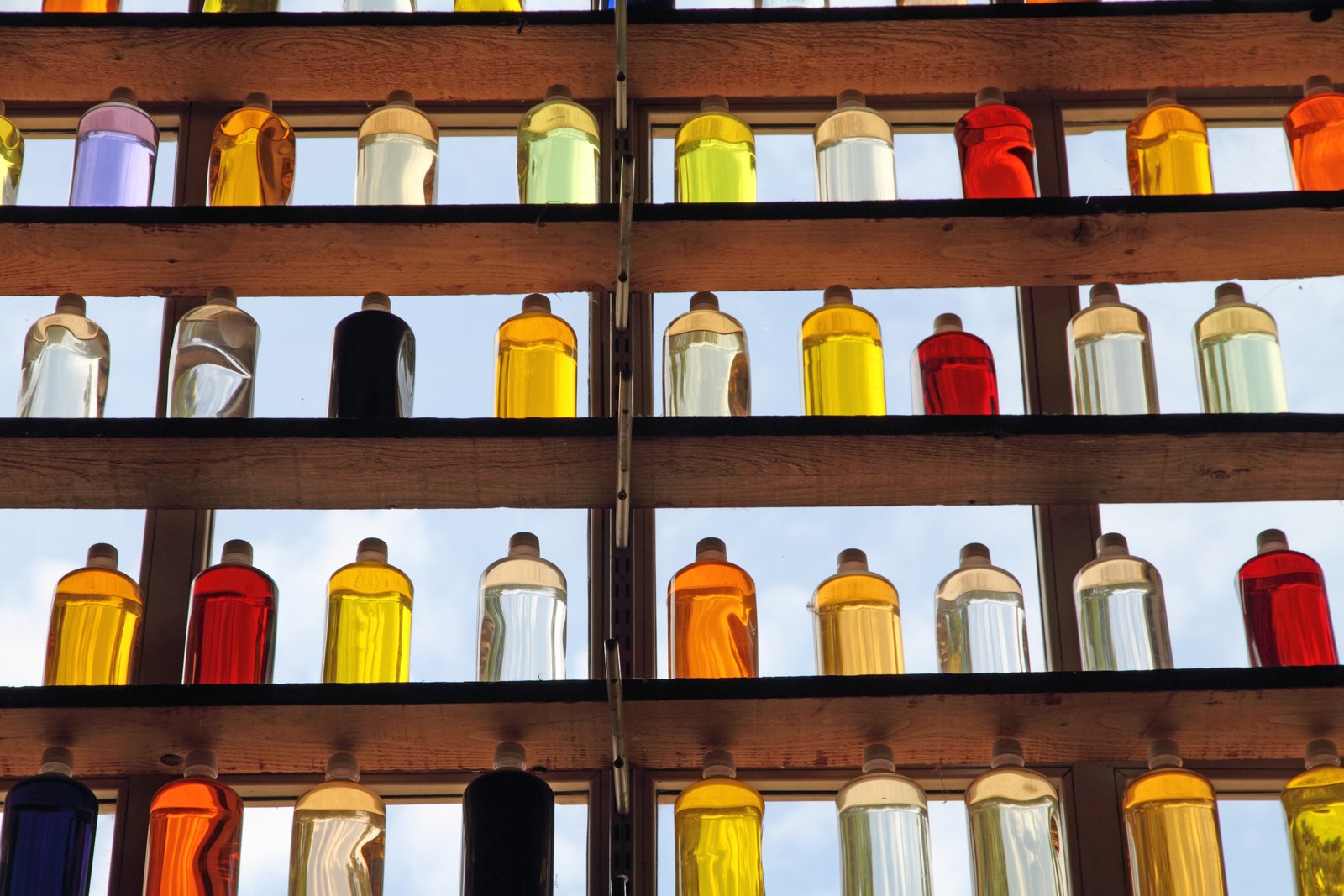
Why Your Bottle Photos Look Flat (And the Two-Light Fix That Changes Everything)
Glass bottles are liars. They look simple. Cylindrical, symmetrical, a label slapped on the front. You set one on a white background, point a light at it, fire the shutter, and get back something that looks like a security camera screenshot. Muddy highlights, a black streak down one side, label washed out or barely visible. I’ve shot thousands of bottles across skincare lines, hot sauce brands, and wine labels, and that first terrible frame is almost a rite of passage. The question is understanding why it happens so you can stop fighting the bottle and start working with it.
Why Glass Behaves Differently Than Every Other Product
Glass and liquid don’t have a surface in the traditional sense. A ceramic mug scatters light. A cotton bag absorbs it. But a bottle transmits, reflects, and refracts light all at the same time, often within millimeters of each other. When you put a single light source directly in front of a bottle, you get a hot white blowout where the light hits the curved front surface, and a hard black shadow on the sides where no light reaches. The label, sandwiched between those two extremes, often reads as flat or overexposed.
The other issue is that bottles are tall and narrow. A light that’s perfectly positioned for a 4-inch candle jar needs to be repositioned, often significantly, for a 10-inch wine bottle. Height and angle both matter, and a few centimeters in either direction change the shot.
The Two-Light Setup That Actually Works
The industry standard for bottles is rim lighting, sometimes called edge lighting. Instead of front-lighting the bottle, you place two strip softboxes (or white foam boards if you’re working on a budget) on either side of the bottle, slightly behind it, angling inward. This wraps light around the bottle’s curved sides, creating two clean vertical highlights that define the shape and give the product dimension. The label sits in the middle, in softer, more even light, and reads clearly.
For equipment, I use two Godox SL60W LED monolights fitted with 12x55cm strip softboxes. The strip shape is important because it creates that long, clean vertical highlight rather than a round blob. I set both lights to equal power, roughly 1/4 to 1/8 output depending on the bottle’s color and how much the liquid inside absorbs light. Darker liquids like whiskey or olive oil need slightly more power than clear glass or water-based serums.
Camera settings: I shoot bottles at f/11 for sharpness across the full label, ISO 100, and dial in the shutter speed to taste, usually between 1/125 and 1/200 when using strobes. I always shoot tethered into Lightroom Classic so I can check sharpness and highlight clipping on a monitor rather than squinting at the back of my camera.
One more thing most tutorials skip: put a small piece of white foamcore directly behind the bottle, between the two lights, to bounce a little fill onto the back surface. Without it, the background can go gray or muddy even on a white sweep. That piece of foamcore costs about $1 at the dollar store and fixes a problem that otherwise takes ten minutes of post-processing to correct.
The Label Problem Nobody Talks About
Labels are almost a separate photography problem from the bottle itself. Matte labels on dark glass are the easiest. Glossy labels on clear glass are the hardest. The same rim lighting setup that makes the bottle look beautiful will sometimes throw a reflection directly onto a glossy label, and you won’t always catch it until you’re in post.
My fix is a sheet of circular polarizing film, not a polarizing filter on the lens, but a large polarizing sheet placed in front of one or both lights. You can find them on Amazon for around $15. Rotate the sheet until the label glare disappears. This is the same principle as a CPL filter on a lens, just applied at the light source instead. It works especially well for bottles with gold or silver foil labels, which are basically mirrors.
When One Difficult Client Taught Me to Slow Down
A few years into my career, a hot sauce brand hired me to photograph their entire line, eight bottles in different colors, mix of matte and glossy labels, varying heights. I had done plenty of bottles before, so I set up my standard two-light rig and started shooting. By bottle four I noticed the label on their flagship product kept showing a faint shadow from the bottle’s own neck. I had positioned my lights at the same height I use for shorter skincare bottles, and the taller neck was casting down onto the label below it.
I had to stop, reposition both lights about six inches higher, re-expose, and reshoot the first four bottles. That extra hour cost me, but the corrected files were clean. The lesson wasn’t that I had done something wrong. It was that bottles require you to evaluate the full height of the product before you lock in your light positions. I now photograph a test frame with my hand held flat at the label height and one at the cap height, just to see where the light falls before I commit to a setup.
Backgrounds, Color, and What to Shoot On
White acrylic is my go-to surface for bottles. It gives a clean, seamless reflection beneath the bottle without the effort of a liquid pour or the mess of a mirrored tile. I use a 24x24 inch white acrylic panel from TAP Plastics, around $25 cut to size, laid on a white foam core base. The reflection is soft and even and adds a premium feel that’s become standard in skincare and spirits e-commerce.
For colored backgrounds, I use seamless paper. Savage Widetone comes in over 60 colors and rolls out cleanly. I match background colors to label palettes using my Pinterest board organized by hue, which sounds obsessive until it saves you twenty minutes of second-guessing in the studio.
The single most important thing you can do to improve your bottle photography is move your lights behind the product, not in front of it. That one change alone will do more for your images than any preset or post-processing trick you’ll ever find.