Why Your Bottle Photos Look Flat (And the Lighting Fix That Actually Works)
The Problem Isn’t Your Camera
I’ve reviewed a lot of product photos from small business owners trying to sell their own stuff online, and bottles trip people up more than almost anything else. Skincare founders, hot sauce makers, wine brands starting out on Shopify, they all send me the same types of images: flat labels, blown-out highlights down the side of the glass, and a weird green or orange color cast that makes the product look cheap even when it isn’t.
The camera isn’t the problem. The phone isn’t the problem. The problem is that bottles are essentially mirrors, and nobody tells you that upfront.
What Glass and Plastic Actually Do to Light
When you point any light source directly at a cylindrical bottle, you get a specular highlight, which is just the reflection of your light source mapped onto a curved surface. The rounder the bottle, the more compressed and harsh that highlight becomes. If your light is small relative to the bottle, the highlight is a thin, bright stripe that reads as a flaw. If your light is large and diffused, that same highlight becomes a wide, soft gradient that adds dimension and makes the product look expensive.
This is physics, not opinion. The size of the reflection you see on a surface is determined by the size of the light source relative to the subject, not the power of the light. A 500-watt bare strobe looks like a pinpoint on a wine bottle. A $12 piece of white foam core bouncing a clip light looks like a window.
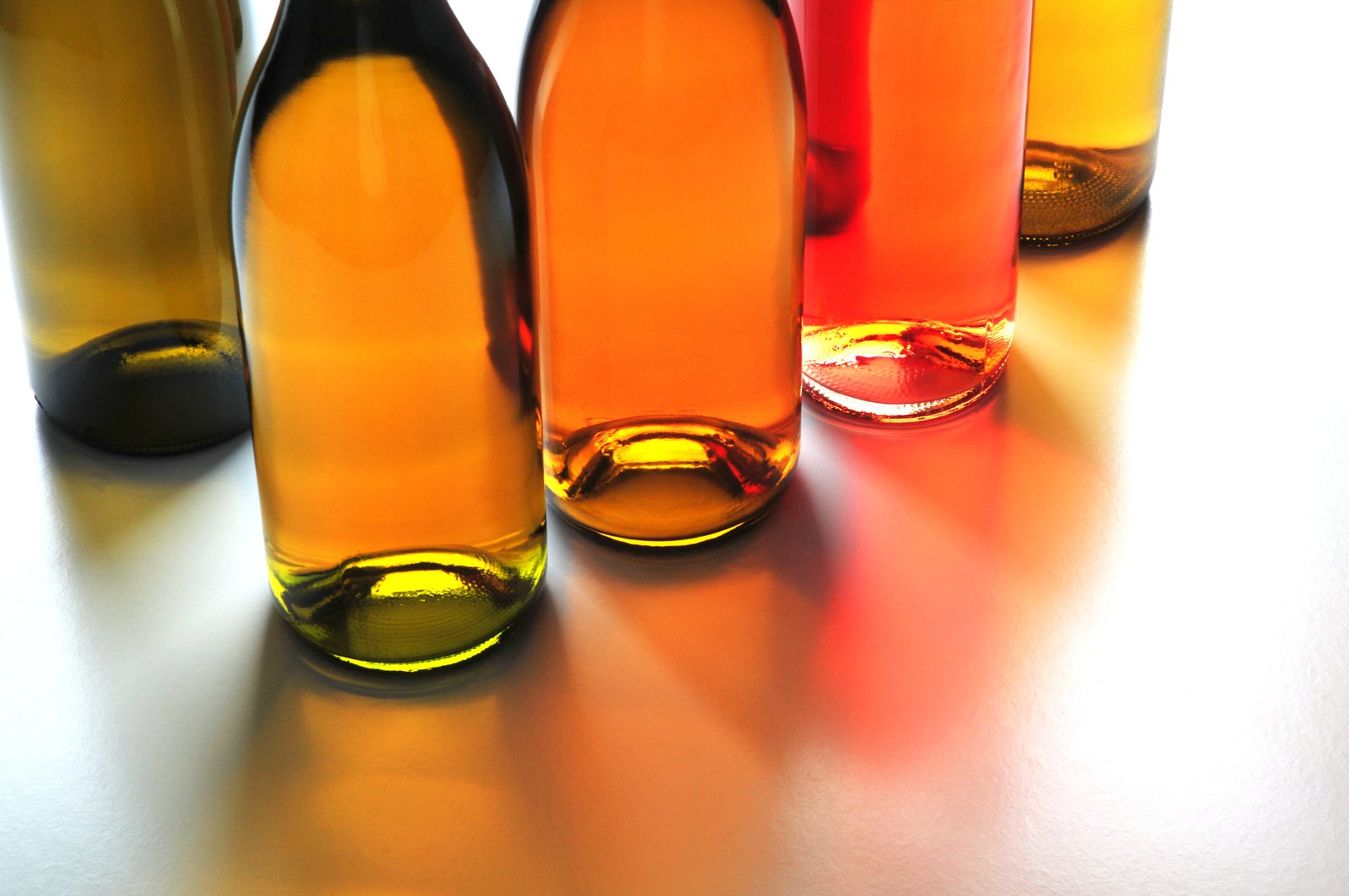
For transparent bottles specifically, there’s a second issue: whatever is behind the bottle shows through it. Shoot a glass bottle of olive oil against a white seamless with one front light, and your light background bleeds through the liquid and kills the color. Shoot it with a darker or controlled background and suddenly the liquid glows.
The Two-Light Setup I Use for Almost Every Bottle
My go-to for bottle work is a split edge-lighting approach. I place two strip softboxes (I use Godox 30x140cm strips, about $80 each) on either side of the bottle, angled slightly toward the back of the subject rather than straight at the front. This creates two vertical bands of light along the edges of the bottle that define its shape without creating a hot center highlight.
The ratio I start with is 1:1, both lights at equal power, usually around f/8 at ISO 100 on a tethered Sony a7R IV. Then I adjust from there. If the label needs more visibility, I bring the front left light up by about a third of a stop. If the bottle has embossing or texture I want to show, I drop one side and add a small reflector card on the opposite side to kick a little fill light back in.
For the background, I almost always use a white acrylic sheet for product-on-white e-commerce shots, backlit with a third light underneath or behind to keep it pure white without overexposing the bottle itself. That separation matters because retail platforms like Amazon and many Shopify themes read background white at RGB 255, 255, 255, and a slightly gray background makes your image look dirty in lineup views.
If the product is a colored liquid, I’ll often add a fourth light positioned directly behind the bottle pointed toward camera, feathered so it doesn’t hit the backdrop. This backlight is what makes amber whiskey glow amber instead of looking like brown plastic.
The Kitchen Test I Run Before Every Shoot
I actually test most of my bottle setups in my kitchen before moving to my studio space. I have a small two-by-two-foot lightbox on my counter that I’ve been using for years to prototype lighting situations before committing to a full setup. For bottles specifically, I’ll use a phone flashlight through a piece of parchment paper taped to a cardboard frame as a stand-in for my strip softbox, just to see how the highlights are behaving and where my problem areas will be.
It sounds ridiculous but it saves real time. I once had a new skincare client ship me 40 black glass bottles for a shoot, and during the kitchen test I discovered the bottles had a subtle iridescent coating that was picking up color from my background paper. I switched to a neutral gray background and adjusted before the actual shoot day, instead of finding out two hours into a paid session.
Editing Bottles Without Making Them Look Fake
The most common editing mistake I see is over-masking the bottle and correcting it separately from the background, which creates a hard edge that looks composited even when it wasn’t. Instead, I work in Lightroom to get my overall exposure and white balance correct, then bring the file into Photoshop and use a Curves adjustment with a luminosity mask to bring down just the bright specular streaks without affecting the label or the liquid.
For color accuracy on liquids, I always shoot with an X-Rite ColorChecker Passport in the first frame of any new setup and use that to create a custom camera profile in Lightroom. Liquid color, especially wine reds and herbal greens, shifts significantly under different color temperatures, and no amount of eyeballing the white balance slider will get you to accurate. The ColorChecker Passport runs about $99 and it is one of the best $99 I’ve spent on this business.
Final export for e-commerce is typically sRGB, JPEG at quality 80-85 in Photoshop’s Save for Web, targeting a file size under 500KB for fast page load without visible compression artifacts. Most platforms don’t need more than 2000 pixels on the long edge.
The single most important thing you can take from all of this: your bottle is not your subject, the light on your bottle is your subject. Fix how the light lands, and every other problem gets easier.