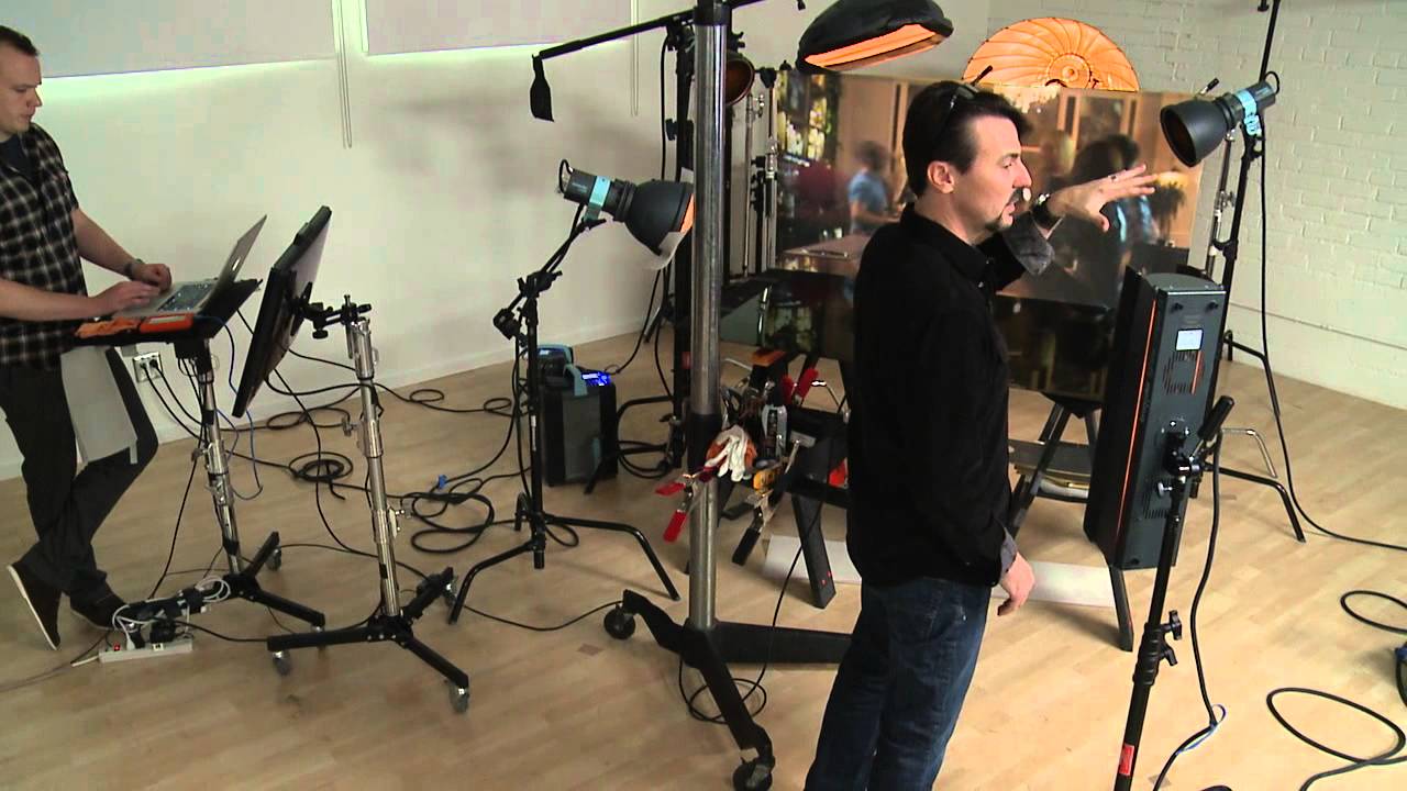
Why Gold Tones Are the Hardest Thing to Light in Beverage Photography (And How Rob Grimm Handles It)
Gold has humbled me more times than I care to admit. I have a Pinterest board organized entirely by color, and my “warm metallics” section is the most dog-eared, most referenced, most frustrating category in it. When a client brings me a whiskey bottle, a craft beer, or anything with gold foil labeling, the challenge is never just getting the product sharp and clean. It is getting that warmth to glow rather than muddy. Nail it, and the bottle looks expensive. Miss it, and you have a photo that reads “stock image from 2009.”
That is exactly why I kept coming back to this CreativeLive tutorial featuring commercial photographer Rob Grimm. Watch the full tutorial on YouTube before or after reading this breakdown. Grimm shoots at the highest level of commercial beverage work, and watching him troubleshoot gold tones in real time is genuinely more educational than any textbook explanation. What follows is my step-by-step breakdown of the techniques he demonstrates, written so you can use them in your own studio without having to pause and rewind a dozen times.
Step 1: Start With a Calibrated Reference Monitor
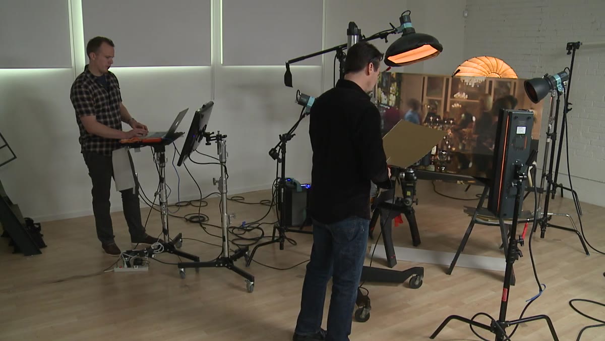 Photographer comparing color on a calibrated computer monitor
Before Grimm touches a reflector or adjusts a light, he is checking his color on a properly calibrated monitor rather than trusting the large display on set. This distinction matters enormously. Big on-set monitors are convenient for framing and composition, but their color accuracy is often compromised by ambient light, viewing angle, or simply factory calibration that prioritizes brightness over accuracy.
Photographer comparing color on a calibrated computer monitor
Before Grimm touches a reflector or adjusts a light, he is checking his color on a properly calibrated monitor rather than trusting the large display on set. This distinction matters enormously. Big on-set monitors are convenient for framing and composition, but their color accuracy is often compromised by ambient light, viewing angle, or simply factory calibration that prioritizes brightness over accuracy.
If you are shooting tethered, make your color judgments on a calibrated screen, even if it is smaller. Grimm catches that his gold is reading more dramatic on the large monitor than it actually is in the file, which saves him from overcorrecting. A $150 colorimeter on your editing monitor will prevent more reshoots than almost any other investment you make.
Step 2: Choose Your Fill Card Deliberately, and Know the Trade-Off With Gold
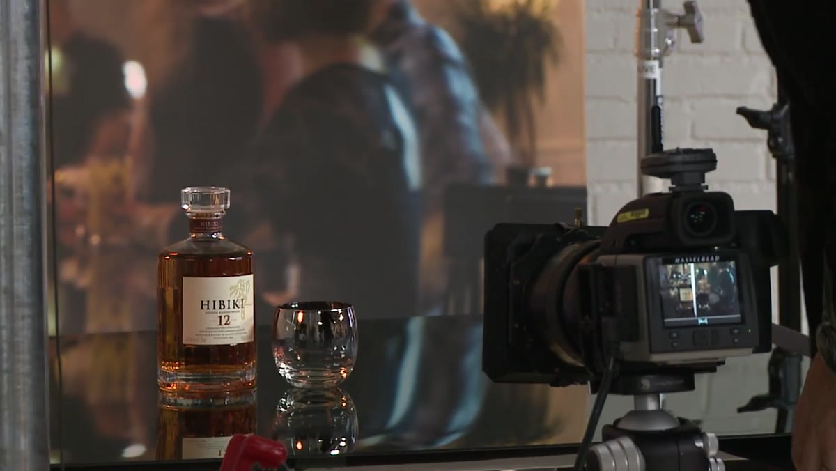
 Gold reflector card positioned beside a bottle in the studio
Here is where Grimm makes a point that shifted how I think about metallic product photography. A white card fills light evenly and predictably. A gold card adds warmth, but it does not distribute that light the same way. You get hot spots, uneven gradients, and areas that simply refuse to pick up the tone you are trying to introduce.
Gold reflector card positioned beside a bottle in the studio
Here is where Grimm makes a point that shifted how I think about metallic product photography. A white card fills light evenly and predictably. A gold card adds warmth, but it does not distribute that light the same way. You get hot spots, uneven gradients, and areas that simply refuse to pick up the tone you are trying to introduce.
His approach is not to abandon the gold card. It is to go in knowing you will need to work harder and potentially composite multiple exposures. Understanding the limitation upfront keeps you from spinning your wheels trying to achieve a single perfect frame when the material itself will not cooperate. Pick your card based on the tone you want, then build your shooting plan around that card’s behavior rather than fighting it.
Step 3: Break the Bottle Into Zones and Shoot Each Separately
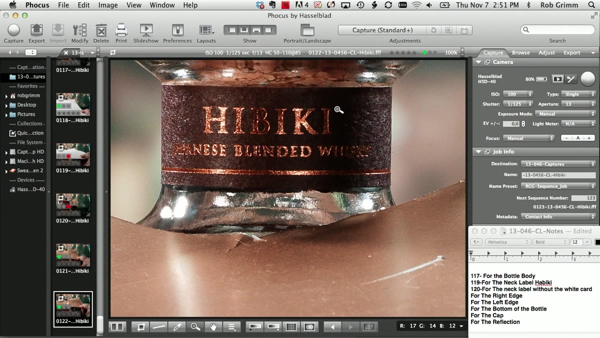
 Photographer reviewing separate exposures for bottle base and neck label
Grimm explicitly separates his shooting into distinct zones: the base of the bottle and the neck label get their own dedicated exposures. This is standard practice in high-end commercial work, but it trips up a lot of photographers who are trying to get everything in one frame. The base of a bottle and the neck are almost always lit by different qualities and angles of light, and the gold details in each zone need their own treatment.
Photographer reviewing separate exposures for bottle base and neck label
Grimm explicitly separates his shooting into distinct zones: the base of the bottle and the neck label get their own dedicated exposures. This is standard practice in high-end commercial work, but it trips up a lot of photographers who are trying to get everything in one frame. The base of a bottle and the neck are almost always lit by different qualities and angles of light, and the gold details in each zone need their own treatment.
When you are shooting, label your files as you go. Grimm references which card position corresponds to which age or label variant so there is no guessing in post. That organizational discipline is what separates a commercial shooter from a hobbyist. Spend ten seconds naming a file correctly and save yourself twenty minutes of confusion later.
Step 4: Use Handheld Cards for Fast, Flexible Control
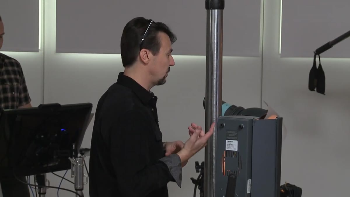
 Photographer holding a reflector card by hand near the bottle
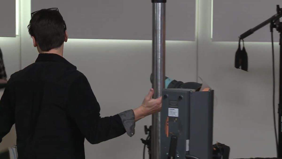
Rather than clamping every card to a stand, Grimm moves his fill cards by hand to find the exact angle that kicks light into the right spot. It is faster, more responsive, and lets you feel your way to the sweet spot rather than making incremental stand adjustments and reviewing after each one.
Photographer holding a reflector card by hand near the bottle
Rather than clamping every card to a stand, Grimm moves his fill cards by hand to find the exact angle that kicks light into the right spot. It is faster, more responsive, and lets you feel your way to the sweet spot rather than making incremental stand adjustments and reviewing after each one.
The trade-off is that you need a second person or a way to lock in the position once you find it. In my studio I will often find the angle by hand, mark the floor position with tape, then mount the card. But Grimm’s point stands: over-engineering your rig at the start of a setup slows everything down. Get the light right first, then worry about making it permanent.
Step 5: Evaluate Warmth Against Your Actual Target Color
 Close-up comparison of warm gold tones on monitor versus bottle label
Grimm catches himself mid-shoot looking at the wrong color reference and recalibrating. He notes the image is reading “a lot warmer” than the target, and he adjusts his assessment accordingly. This is not a mistake, it is the process. Gold tones are slippery because warm light bouncing off a warm surface creates a compounding effect that can push the image into orange territory fast.
Close-up comparison of warm gold tones on monitor versus bottle label
Grimm catches himself mid-shoot looking at the wrong color reference and recalibrating. He notes the image is reading “a lot warmer” than the target, and he adjusts his assessment accordingly. This is not a mistake, it is the process. Gold tones are slippery because warm light bouncing off a warm surface creates a compounding effect that can push the image into orange territory fast.
The fix is to keep your actual product in frame during evaluation, or have a color chip from the label pulled up on your reference monitor as a constant comparison point. Your eye adapts. Your calibrated monitor does not. Trust the numbers over your gut when you are deep in a warmth-heavy setup.
Step 6: Assign and Log Each Card Position to a Specific Exposure
 Photographer noting which card position corresponds to which bottle variant
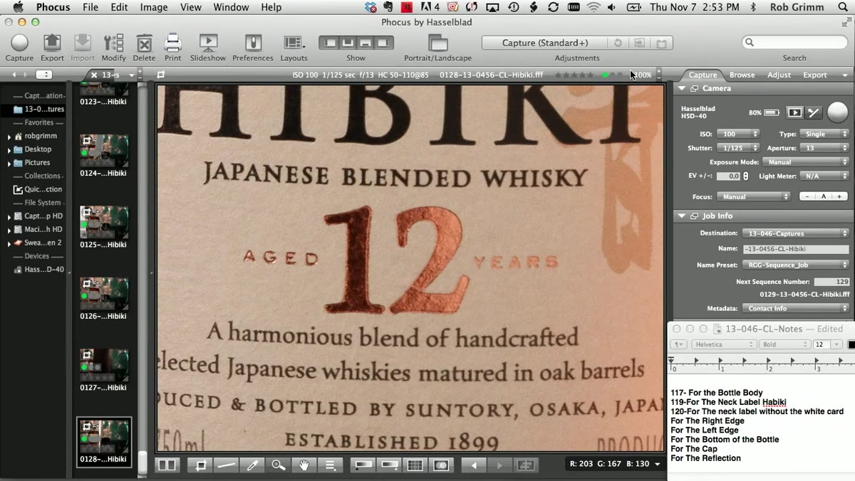
In the final stage of this sequence, Grimm is methodical about linking each card position to a specific file. One card position covers one label variant, another covers a second. The casual way he handles this is actually the result of deeply ingrained habit, not carelessness. He knows exactly what each frame is for because he decided before he shot it.
Photographer noting which card position corresponds to which bottle variant
In the final stage of this sequence, Grimm is methodical about linking each card position to a specific file. One card position covers one label variant, another covers a second. The casual way he handles this is actually the result of deeply ingrained habit, not carelessness. He knows exactly what each frame is for because he decided before he shot it.
Build this into your own workflow as a pre-shoot checklist item. Write down: bottle zone, card color, card angle, intended use. Even on a small product shoot with two or three variants, this eliminates the “wait, which one was the two-year?” problem entirely.
What I Do Differently With Smaller Budgets
Grimm is working with high-quality card stock and a fully staffed commercial studio. Most of my clients are small brands shooting with tighter constraints. What I have found is that gold foam board from a craft store behaves similarly to a professional gold card for smaller bottle formats, with one key difference: the surface texture is less consistent, so you need to flag any specular hot spots more carefully.
I also shoot smaller products in my kitchen lightbox for initial tests before committing to a full studio setup. Getting the zone-by-zone logic right on a test run saves expensive studio time. The principles Grimm demonstrates scale down cleanly. The discipline does not change just because the budget is smaller.
The single biggest thing I took from watching Grimm work is this: gold does not forgive lazy setup decisions, but it rewards patience. Shoot in zones, evaluate on a calibrated screen, and move your fill cards by hand until the warmth lands exactly where the label needs it. That sequence, done consistently, is what makes a metallic product look intentional rather than accidental.
Watch the full tutorial on YouTube to see Grimm’s real-time decision-making in action. The way he talks through his doubts and adjustments mid-shoot is worth the watch on its own.