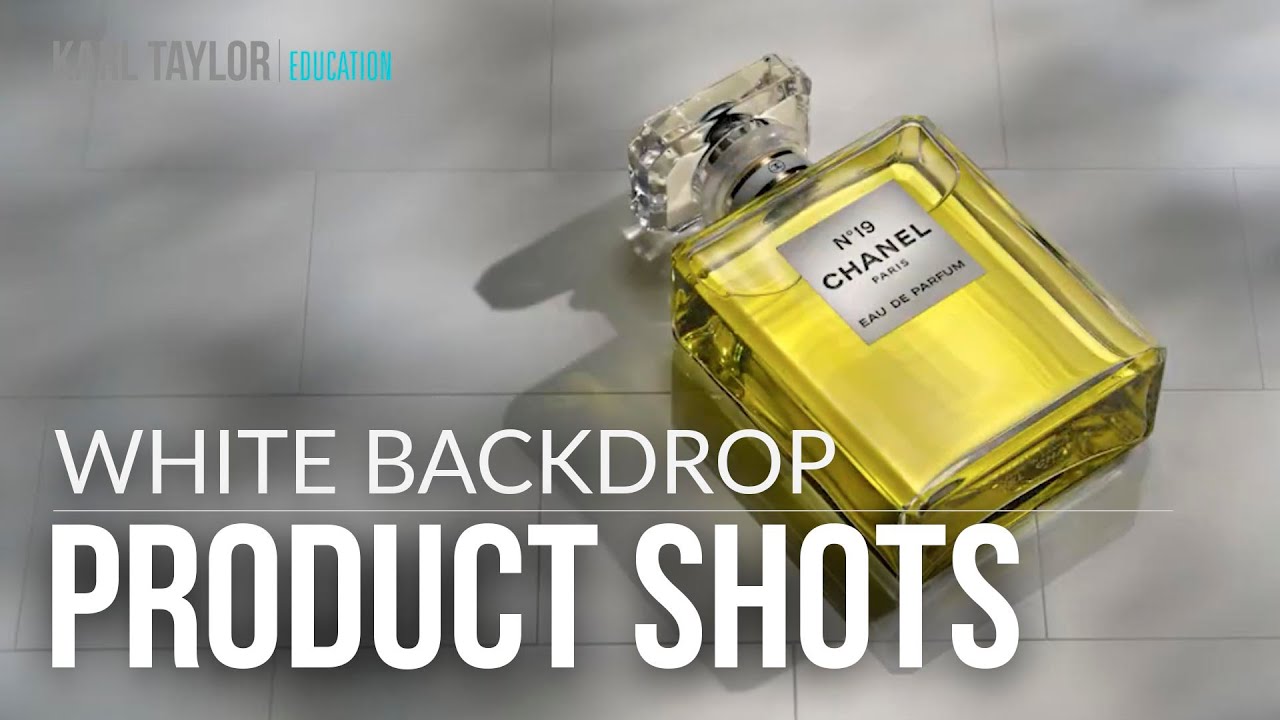
White Background Product Photography: The Lighting and Exposure Secrets That Actually Work
I photograph products on white backgrounds almost every week. White sounds simple, even boring, but it is genuinely one of the most technically demanding setups you can attempt. Get it wrong and your product looks flat, washed out, or gray. Get it right and suddenly a $30 candle looks like it belongs in a Sephora catalog. That gap between “fine” and “premium” is almost always a lighting and exposure problem, not a product problem. I learned that lesson the hard way when I helped my mom relaunch her jewelry business online. The products were beautiful. The photos looked like evidence photos. Fixing the lighting tripled her sales.
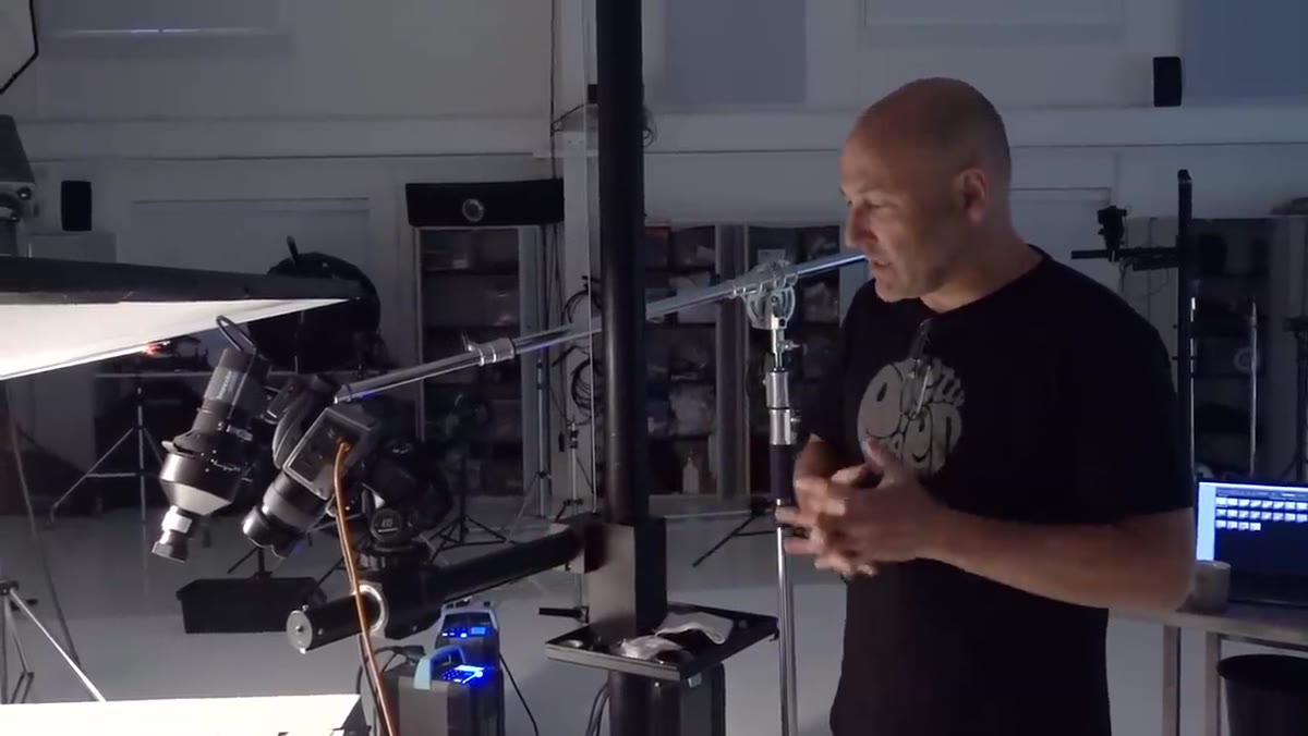
So when I came across this Visual Education tutorial on photographing products on a white background, I watched the whole thing with my notebook open. Watch the full tutorial on YouTube — it covers a Chanel No. 19 perfume bottle shoot on gloss white acrylic, and the technical depth here is real. What follows is my step-by-step breakdown of the techniques, translated into language you can apply in your own studio or spare bedroom.
Step 1: Choose Your Surface Deliberately
 Gloss white acrylic sheet on the shooting surface
The tutorial uses gloss white acrylic as the shooting surface, not paper, not foam core, not a bedsheet. That choice is doing serious work. Gloss acrylic creates natural reflections that add depth to product shots, especially for anything with a shiny or transparent surface like glass bottles, ceramics, or jewelry. Matte surfaces absorb light and kill that sense of dimension. If you are shooting e-commerce products that need to look tactile and premium, gloss acrylic is worth the investment. You can find it at most plastics suppliers for around $20-40 per sheet depending on size.
Gloss white acrylic sheet on the shooting surface
The tutorial uses gloss white acrylic as the shooting surface, not paper, not foam core, not a bedsheet. That choice is doing serious work. Gloss acrylic creates natural reflections that add depth to product shots, especially for anything with a shiny or transparent surface like glass bottles, ceramics, or jewelry. Matte surfaces absorb light and kill that sense of dimension. If you are shooting e-commerce products that need to look tactile and premium, gloss acrylic is worth the investment. You can find it at most plastics suppliers for around $20-40 per sheet depending on size.
Step 2: Plan Lighting Variations Before You Commit to One Look
 Side-by-side perfume bottle shots with different lighting moods
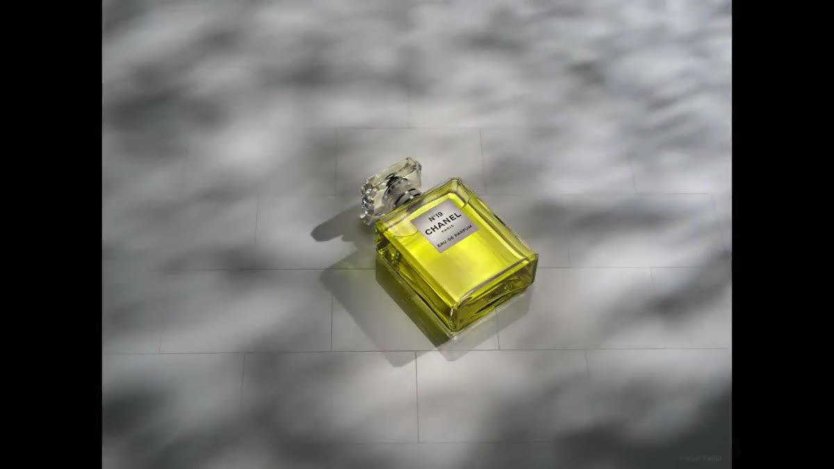
One of the most valuable things demonstrated in this tutorial is the practice of exploring multiple lighting setups within a single shoot rather than locking in the first thing that works. The session covers soft and diffused light, directional beams, refracted light through the bottle, dappled light that mimics sunlight through leaves, and a window-light simulation. Each one changes the mood of the image completely even though the composition and product never move.
Side-by-side perfume bottle shots with different lighting moods
One of the most valuable things demonstrated in this tutorial is the practice of exploring multiple lighting setups within a single shoot rather than locking in the first thing that works. The session covers soft and diffused light, directional beams, refracted light through the bottle, dappled light that mimics sunlight through leaves, and a window-light simulation. Each one changes the mood of the image completely even though the composition and product never move.
For working photographers, this approach protects you against delivering a set of images that all feel the same. For small business owners shooting their own products, it means you should not stop after your first decent-looking frame. Move a light a foot to the side. Add a reflector. Block part of the light source with a card. Spending an extra 20 minutes testing variations will give you options that serve different uses, from website hero images to social media close-ups.
Step 3: Use Lighting to Control Emotional Tone
 Two identical compositions showing contrasting lighting moods
The tutorial makes a point that I think gets underestimated in e-commerce photography specifically: lighting conveys emotion. Two shots with identical framing and the same product can feel completely different depending on how the light is shaped and directed. Soft, diffused, even light reads as clean and clinical, which is great for certain categories like supplements or tech accessories. Directional, warmer, more dramatic light reads as luxurious or editorial, which suits beauty, lifestyle, and artisan products.
Two identical compositions showing contrasting lighting moods
The tutorial makes a point that I think gets underestimated in e-commerce photography specifically: lighting conveys emotion. Two shots with identical framing and the same product can feel completely different depending on how the light is shaped and directed. Soft, diffused, even light reads as clean and clinical, which is great for certain categories like supplements or tech accessories. Directional, warmer, more dramatic light reads as luxurious or editorial, which suits beauty, lifestyle, and artisan products.
Before your next shoot, ask what feeling you want the customer to have when they land on your product page. Then build your lighting to match that feeling. This is not just aesthetic preference. It directly affects conversion. A skincare brand targeting a spa-going customer base should not be lit like a medical device catalog.
Step 4: Monitor Your RGB Values in Real Time
 Tethered software displaying RGB channel values on a white area
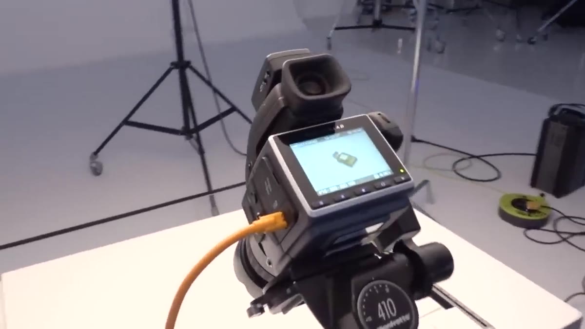
This is the most technically specific, and most frequently ignored, advice in the tutorial. When shooting on a white background, you need to watch your RGB values in your tethered software, whether that is Capture One, Lightroom, or Phocus. In the RGB color model, a value of 255 in all three channels is pure white. But “pure white” in digital terms means blown out, with no detail and no texture. That is not what you want on a gloss surface.
Tethered software displaying RGB channel values on a white area
This is the most technically specific, and most frequently ignored, advice in the tutorial. When shooting on a white background, you need to watch your RGB values in your tethered software, whether that is Capture One, Lightroom, or Phocus. In the RGB color model, a value of 255 in all three channels is pure white. But “pure white” in digital terms means blown out, with no detail and no texture. That is not what you want on a gloss surface.
The target the tutorial recommends is 250 across all three channels. At 250, the background reads as white to the eye but retains just enough information to avoid the flat, overexposed look. It also reduces flare and unwanted light bouncing back onto your subject from the surface. Start with your lights lower than you think you need them, check your values with a sampler tool on the brightest white area of your frame, then bring the lights up gradually until you hit that 250 ceiling. Do not eyeball this. Use the numbers.
Step 5: Let White Be a Range, Not a Single Value
 Product shot showing varied tones across the white acrylic surface
The final insight in the tutorial reframes how most beginners think about white backgrounds entirely. The goal is not to make everything in the frame pure white. The goal is to maintain neutral whites, meaning whites that do not drift toward yellow, blue, or gray, while allowing different areas of the frame to sit at different luminosity levels.
Product shot showing varied tones across the white acrylic surface
The final insight in the tutorial reframes how most beginners think about white backgrounds entirely. The goal is not to make everything in the frame pure white. The goal is to maintain neutral whites, meaning whites that do not drift toward yellow, blue, or gray, while allowing different areas of the frame to sit at different luminosity levels.
In the Chanel shoot, some areas of the acrylic approach pure white while others stay several stops darker. That variation is what gives the image depth and visual interest. A completely blown-out white background with zero tonal variation looks cheap on screen, even when it is technically “correct” by e-commerce platform standards. If you are shooting for Amazon’s pure white requirement (RGB 255), do that in post, not in camera. Shoot with some latitude and handle the white expansion during editing so you do not destroy the product detail in the process.
A Note From My Own Experience With Gloss Surfaces
I have a lightbox in my kitchen that I use for quick tests, and gloss acrylic is the one thing I cannot replicate in that environment because the reflections require enough space and light control that a compact setup just cannot deliver. If you are working in a small space, semi-gloss acrylic is a reasonable compromise. It gives you some of the dimensional quality of full gloss without the aggressive reflections that need multiple lights to manage. For full gloss, you need room to place lights at low angles without them appearing in the surface. Budget at least 6-8 feet of working distance from the background to the camera before committing to this setup.
The single most important thing I took from this tutorial is the RGB 250 rule. It is a small number with a big impact. Every product photographer I know who moved from shooting by eye to monitoring actual channel values saw an immediate improvement in the consistency of their white backgrounds across a full shoot. It takes an extra minute to set up your color sampler. It saves a significant amount of time in post.
Watch the full tutorial on YouTube to see the complete perfume bottle shoot and all the lighting variations side by side. The visual comparison between lighting moods alone is worth the watch time.