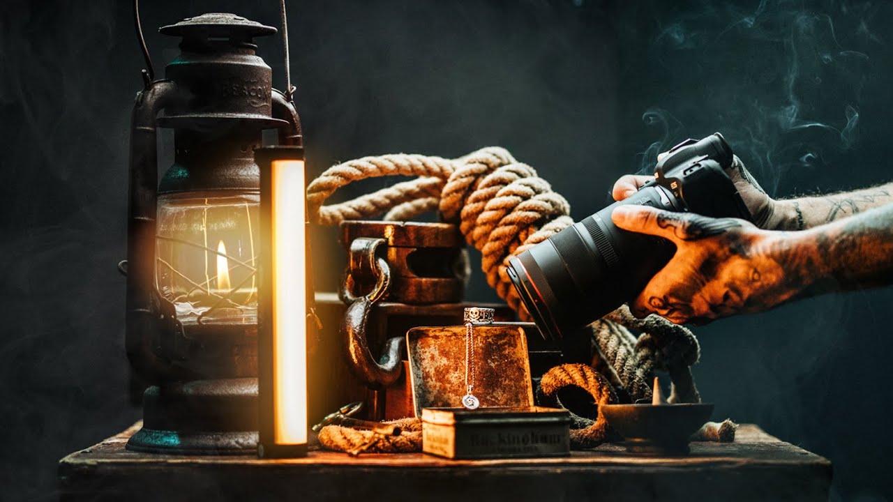
Theme First, Camera Second: What Peter McKinnon's Product Photography Process Gets Right
There’s a question I get from nearly every small business owner I work with: “Why do my product photos look flat even when the lighting seems fine?” I used to struggle to answer that quickly, because the real answer isn’t about one setting or one piece of gear. It’s about a whole approach, starting well before you press the shutter. That’s exactly why I keep coming back to this tutorial from Peter McKinnon, where he shoots jewelry for an actual product launch from start to finish. Watch the full tutorial on YouTube before or after reading this breakdown.
What makes it worth studying isn’t the gear (though we’ll talk about that). It’s the sequence of decisions. McKinnon doesn’t pick up his camera until he’s already solved the hardest problem: what does this product feel like, and how do I make someone feel that in a still image? That question is the whole job. I started asking it after a friend’s Etsy shop failed despite having genuinely beautiful handmade jewelry. I looked at her photos and realized the pieces were sitting on a bare white table under a ceiling light. Technically acceptable. Completely lifeless. The photos weren’t wrong, they were just empty. This tutorial is the antidote to that.
Step 1: Define Your Visual Theme Before You Buy a Single Prop
 McKinnon holding a pendant and describing the brand theme
Every prop decision, every background texture, every lighting choice in this shoot flows from one anchor: the brand’s identity. McKinnon is shooting jewelry for a line built around a nautical, weathered, found-at-sea aesthetic. Before he touches a camera, that theme is already driving his prop sourcing. If you skip this step, you end up with a random pile of stuff that doesn’t cohere. Write down three to five adjectives that describe your product’s personality before you shop for anything. Then use those words as a filter.
McKinnon holding a pendant and describing the brand theme
Every prop decision, every background texture, every lighting choice in this shoot flows from one anchor: the brand’s identity. McKinnon is shooting jewelry for a line built around a nautical, weathered, found-at-sea aesthetic. Before he touches a camera, that theme is already driving his prop sourcing. If you skip this step, you end up with a random pile of stuff that doesn’t cohere. Write down three to five adjectives that describe your product’s personality before you shop for anything. Then use those words as a filter.
Step 2: Source Props from Antique Shops, Not Craft Stores
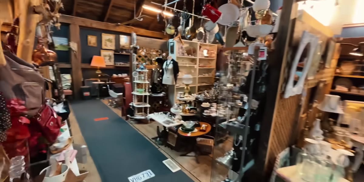
 McKinnon browsing antique shop items for use as props
McKinnon makes a strong case for antique shops as the primary prop source for shoots with a textured, tactile, or vintage-leaning feel. The reason isn’t just aesthetics. Antique items have earned their character. Worn wood, aged metal, and found objects carry visual weight that a brand-new “rustic” prop from a big-box store never quite replicates. When you’re shopping, think beyond “does this look good?” and ask: Can I shoot inside it? Can I shoot on top of it? Does the surface itself work as a background? A prop that does three jobs is worth paying more for.
McKinnon browsing antique shop items for use as props
McKinnon makes a strong case for antique shops as the primary prop source for shoots with a textured, tactile, or vintage-leaning feel. The reason isn’t just aesthetics. Antique items have earned their character. Worn wood, aged metal, and found objects carry visual weight that a brand-new “rustic” prop from a big-box store never quite replicates. When you’re shopping, think beyond “does this look good?” and ask: Can I shoot inside it? Can I shoot on top of it? Does the surface itself work as a background? A prop that does three jobs is worth paying more for.
Step 3: Prioritize Multi-Use Props That Work as Sets and Surfaces
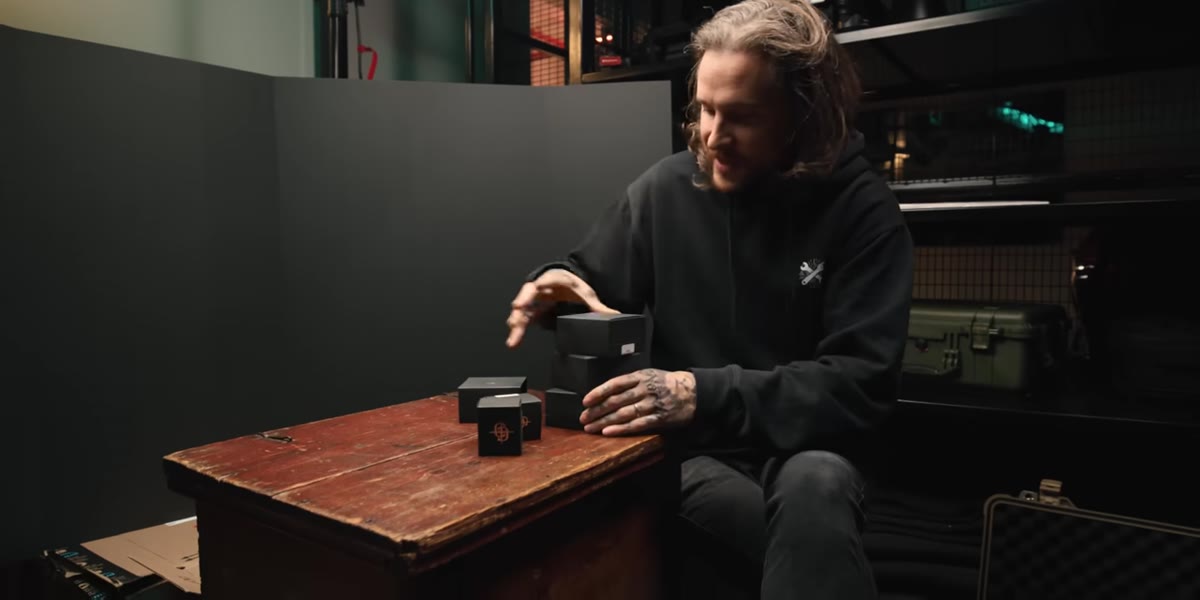 McKinnon showing the antique trunk used as backdrop and shooting surface
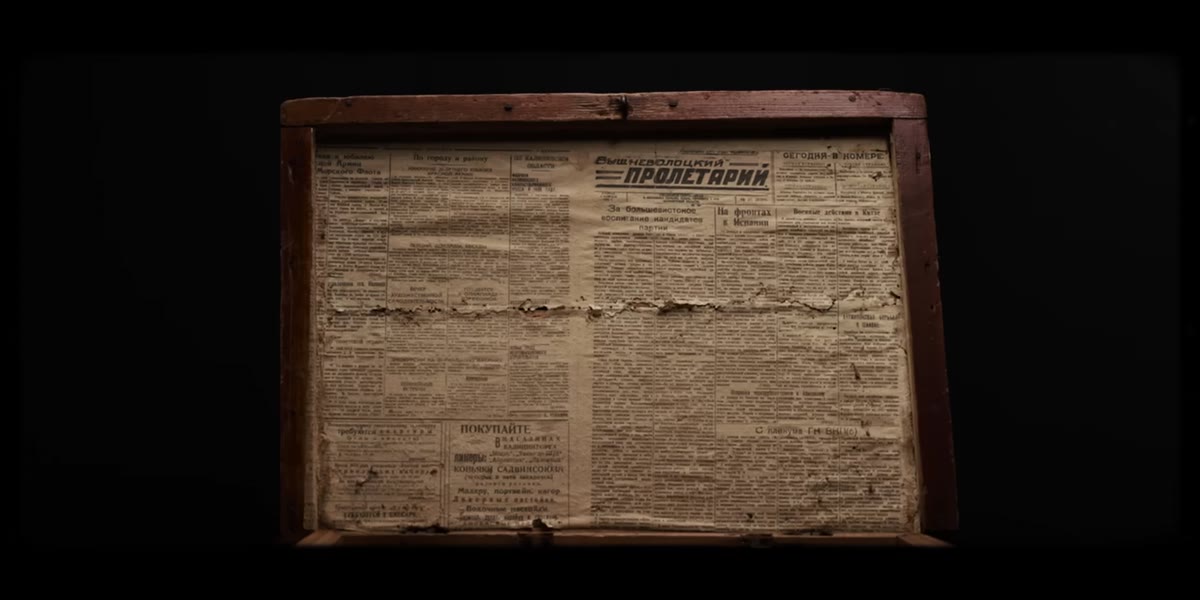
McKinnon walks through his reasoning for buying an old wooden trunk: it works as a set piece, a shooting surface, and a container to place products inside. This kind of multi-function thinking is especially important if you’re working in a small space, which most of us are. I have a kitchen with decent north-facing light and a lightbox on the counter. Every prop I own has to justify its square footage. The trunk’s best surprise was its interior, which was lined with aged newspaper. That kind of organic texture is almost impossible to fake and it instantly grounds the product in the world the brand is trying to suggest.
McKinnon showing the antique trunk used as backdrop and shooting surface
McKinnon walks through his reasoning for buying an old wooden trunk: it works as a set piece, a shooting surface, and a container to place products inside. This kind of multi-function thinking is especially important if you’re working in a small space, which most of us are. I have a kitchen with decent north-facing light and a lightbox on the counter. Every prop I own has to justify its square footage. The trunk’s best surprise was its interior, which was lined with aged newspaper. That kind of organic texture is almost impossible to fake and it instantly grounds the product in the world the brand is trying to suggest.
Step 4: Use Foam Core as a Moveable Background, Not Just a Reflector
 McKinnon taping foam core pieces together with gaff tape
Before any product hits the surface, McKinnon sets up a simple foam core background, two pieces joined with a small strip of gaff tape on the back seam. The tape keeps the seam from gaping and stops the background from shifting mid-shoot. This sounds minor until you’ve spent ten minutes resetting a background between every frame. The foam core isn’t the hero of the shot, it just needs to be neutral, stable, and out of the way. Black, white, or gray all work depending on your product. The point is to eliminate variables so you can focus on light and composition.
McKinnon taping foam core pieces together with gaff tape
Before any product hits the surface, McKinnon sets up a simple foam core background, two pieces joined with a small strip of gaff tape on the back seam. The tape keeps the seam from gaping and stops the background from shifting mid-shoot. This sounds minor until you’ve spent ten minutes resetting a background between every frame. The foam core isn’t the hero of the shot, it just needs to be neutral, stable, and out of the way. Black, white, or gray all work depending on your product. The point is to eliminate variables so you can focus on light and composition.
Step 5: Start with Soft Top-Down Light, Then Deliberately Break It
 Aperture 300D with light dome positioned directly above product
McKinnon uses an Aperture 300D with a light dome positioned directly above the product for his base exposure. Soft top-down light from a dome modifier is a solid starting point for product work because it’s forgiving and consistent. But here’s the part most tutorials skip: he doesn’t keep it there. That even, overhead coverage flattens the scene and strips out the shadow and dimension that give a product character. Once you have your base exposure set, physically move the light forward and to one side until you start seeing meaningful shadow fall across the surface. That shadow is doing the work of communicating texture and depth.
Aperture 300D with light dome positioned directly above product
McKinnon uses an Aperture 300D with a light dome positioned directly above the product for his base exposure. Soft top-down light from a dome modifier is a solid starting point for product work because it’s forgiving and consistent. But here’s the part most tutorials skip: he doesn’t keep it there. That even, overhead coverage flattens the scene and strips out the shadow and dimension that give a product character. Once you have your base exposure set, physically move the light forward and to one side until you start seeing meaningful shadow fall across the surface. That shadow is doing the work of communicating texture and depth.
Step 6: Adjust Light Angle to Add Mood, Not Just Visibility
 Light repositioned to side angle, deeper shadows appearing on surface
The difference between a product photo that looks like a catalog scan and one that looks like an editorial image often comes down to a single light position adjustment. McKinnon shifts his light off-axis to create directional shadow, which adds drama without adding complexity or extra equipment. For jewelry specifically, skulls, textured metals, and engraved surfaces, side lighting rakes across the surface and makes detail pop in a way flat frontal light never will. A good rule: if your product has physical texture you want the viewer to feel, your light source should be coming from the side, not from directly above or in front.
Light repositioned to side angle, deeper shadows appearing on surface
The difference between a product photo that looks like a catalog scan and one that looks like an editorial image often comes down to a single light position adjustment. McKinnon shifts his light off-axis to create directional shadow, which adds drama without adding complexity or extra equipment. For jewelry specifically, skulls, textured metals, and engraved surfaces, side lighting rakes across the surface and makes detail pop in a way flat frontal light never will. A good rule: if your product has physical texture you want the viewer to feel, your light source should be coming from the side, not from directly above or in front.
Step 7: Let the Theme Drive Every Final Compositional Choice
 Ring placed on aged newspaper inside the trunk lid
Once the light is working and the background is set, McKinnon places the product inside the trunk lid against the aged newspaper lining. That composition choice isn’t random. It connects back to the brand theme established in Step 1. Every element in the frame is earning its place: the weathered paper, the worn wood edge, the soft directional light. Composition isn’t just about where the product sits. It’s about whether every surrounding element reinforces the story. Before you shoot your final frames, scan the edges of your frame and ask: does this belong here?
Ring placed on aged newspaper inside the trunk lid
Once the light is working and the background is set, McKinnon places the product inside the trunk lid against the aged newspaper lining. That composition choice isn’t random. It connects back to the brand theme established in Step 1. Every element in the frame is earning its place: the weathered paper, the worn wood edge, the soft directional light. Composition isn’t just about where the product sits. It’s about whether every surrounding element reinforces the story. Before you shoot your final frames, scan the edges of your frame and ask: does this belong here?
What I’d Add from My Own Shoots
McKinnon doesn’t mention this explicitly, but the texture-forward approach he’s using works just as well for small-budget e-commerce shoots if you’re willing to look in unexpected places. I’ve pulled aged cardboard, vintage books, weathered tile samples, and hardware store materials as surfaces for shoots that cost almost nothing in props. The key is that the texture has to be authentic to something, not just visually busy. Random textures create noise. Purposeful textures create atmosphere. When I helped restyle my mom’s jewelry listings with similar principles, specific surfaces tied to the handmade, artisan feel of the pieces, her sales tripled within two months. The products hadn’t changed. The visual story around them had.
The single most transferable idea from this whole tutorial is the sequencing: theme first, props second, light third, camera last. Most people reverse it and wonder why the photos feel hollow. Get the concept locked before you buy a single prop, and every other decision gets easier.
Watch the full tutorial on YouTube to see McKinnon work through the shoot in real time. The way he talks through his reasoning out loud while adjusting the light is worth watching more than once.