How to Create Realistic Bottle Reflections in Photoshop (Commercial Beverage Retouching Breakdown)
Beverage photography is one of those specialties where the difference between a product shot that sells and one that doesn’t comes down to about four or five very specific post-processing decisions. I shoot a lot of packaged goods, and bottles are genuinely some of the trickiest subjects to retouch because the highlights, reflections, and label colors all fight each other. When I first started taking on drink brand clients, I was spending way too long trying to make bottle glints look convincing. The trick, it turns out, is not in capturing a perfect reflection on set. It’s in building it afterward with a handful of Photoshop tools working together.
In this CreativeLive tutorial, Aaron Nace walks through exactly that process during a live commercial beverage retouch session. Watch the full tutorial on YouTube before or alongside reading this, because the visual context helps. What I want to do here is pull the actual technique apart step by step so you can apply it to your own product work without having to reverse-engineer it from the video in real time.
Step 1: Select and Isolate the Highlight Area
 Selecting highlight region on the bottle surface
Start by selecting the area of the bottle where you want to build your reflection or highlight. Aaron uses a standard selection tool and then duplicates the selected area to a new layer using Command J (Ctrl J on PC). This keeps your original image untouched and gives you a separate layer to manipulate without any permanent changes. The key here is precision in the initial selection. A sloppy edge at this stage will haunt every step that follows.
Selecting highlight region on the bottle surface
Start by selecting the area of the bottle where you want to build your reflection or highlight. Aaron uses a standard selection tool and then duplicates the selected area to a new layer using Command J (Ctrl J on PC). This keeps your original image untouched and gives you a separate layer to manipulate without any permanent changes. The key here is precision in the initial selection. A sloppy edge at this stage will haunt every step that follows.
Step 2: Change the Blend Mode to Lighten or Screen
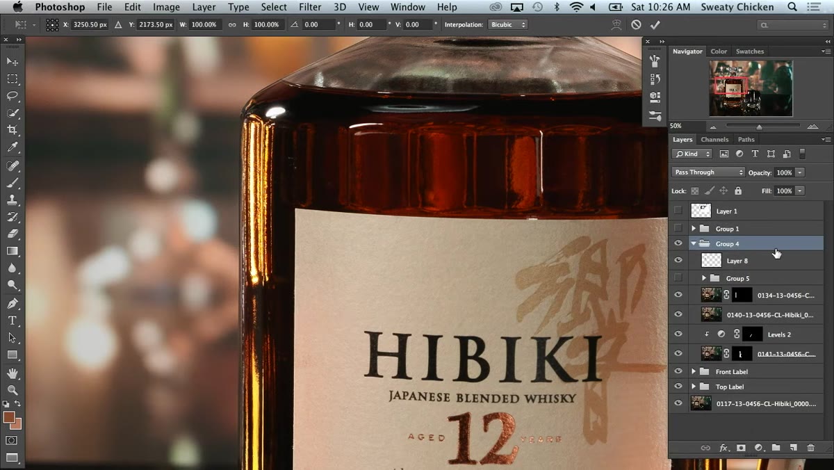 Layer blend mode dropdown set to Lighten
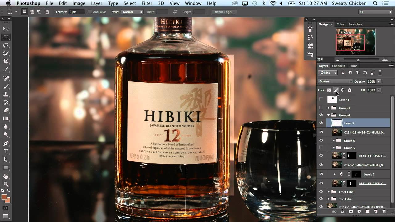
Once you have your duplicated layer, change its blend mode from Normal to Lighten. This is what makes the reflection effect work. Lighten blend mode only affects pixels where the layer is brighter than what’s underneath, which means it naturally mimics the way specular highlights behave on glass and glossy surfaces. Screen is a slightly stronger version of the same logic. Try both and compare. For transparent bottles with liquid inside, Screen often reads more convincingly.
Layer blend mode dropdown set to Lighten
Once you have your duplicated layer, change its blend mode from Normal to Lighten. This is what makes the reflection effect work. Lighten blend mode only affects pixels where the layer is brighter than what’s underneath, which means it naturally mimics the way specular highlights behave on glass and glossy surfaces. Screen is a slightly stronger version of the same logic. Try both and compare. For transparent bottles with liquid inside, Screen often reads more convincingly.
Step 3: Transform and Stretch the Highlight Layer
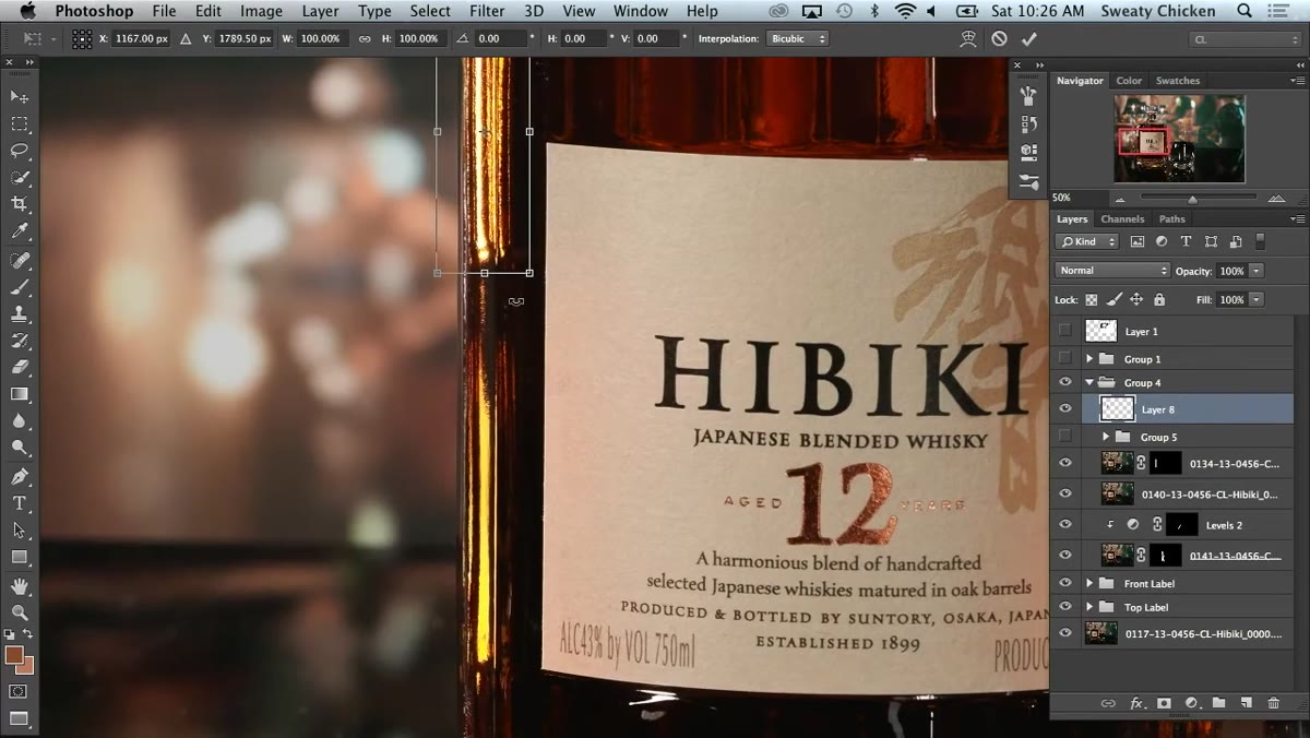 Free Transform active, layer being stretched vertically
With the blend mode set, hit Command T (Ctrl T) to enter Free Transform. Rather than scaling the layer proportionally, drag it vertically to stretch the highlight downward along the length of the bottle. This elongates the glint in a way that matches how light actually travels across a cylindrical surface. The goal is not photorealism at this stage. You’re building a visual suggestion of dimension, and stretched highlights do that work faster than any other technique I know.
Free Transform active, layer being stretched vertically
With the blend mode set, hit Command T (Ctrl T) to enter Free Transform. Rather than scaling the layer proportionally, drag it vertically to stretch the highlight downward along the length of the bottle. This elongates the glint in a way that matches how light actually travels across a cylindrical surface. The goal is not photorealism at this stage. You’re building a visual suggestion of dimension, and stretched highlights do that work faster than any other technique I know.
Step 4: Add a Layer Mask and Paint Back Visibility
 Layer mask applied, painting highlight visible with brush
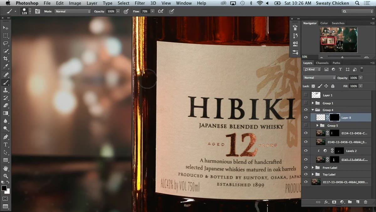
Add a layer mask to the stretched highlight layer, then use a soft brush with black paint to hide the areas where the highlight doesn’t belong. Paint white where you want it visible. This is where you control the falloff. Aaron mentions letting the highlight carry further down the left side of the bottle while keeping it shorter on the right, where a glass is breaking up the composition. That kind of asymmetry reads as natural rather than artificial. A gradient on the mask works well here too. Fade the bottom of the highlight so it doesn’t appear equally bright from shoulder to base.
Layer mask applied, painting highlight visible with brush
Add a layer mask to the stretched highlight layer, then use a soft brush with black paint to hide the areas where the highlight doesn’t belong. Paint white where you want it visible. This is where you control the falloff. Aaron mentions letting the highlight carry further down the left side of the bottle while keeping it shorter on the right, where a glass is breaking up the composition. That kind of asymmetry reads as natural rather than artificial. A gradient on the mask works well here too. Fade the bottom of the highlight so it doesn’t appear equally bright from shoulder to base.
Step 5: Use a Clipping Mask with a Curves Adjustment Layer
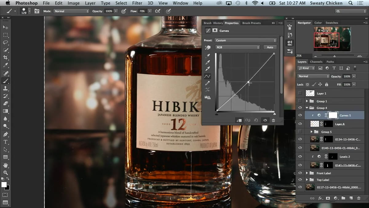 Curves adjustment layer clipped to highlight layer
To deepen the shadow at the base of the bottle without affecting the whole image, add a Curves adjustment layer and clip it to the highlight layer using Option-click (Alt-click) between the two layers in the Layers panel. Pull the curve down to darken. Then add a layer mask to the Curves adjustment itself and paint it so the darkening effect only shows up in the lower portion of the bottle. The combination of a clipping mask and a layer mask sounds complex but takes about thirty seconds once you’ve done it twice. It gives you surgical control over tonal adjustments on a per-region basis.
Curves adjustment layer clipped to highlight layer
To deepen the shadow at the base of the bottle without affecting the whole image, add a Curves adjustment layer and clip it to the highlight layer using Option-click (Alt-click) between the two layers in the Layers panel. Pull the curve down to darken. Then add a layer mask to the Curves adjustment itself and paint it so the darkening effect only shows up in the lower portion of the bottle. The combination of a clipping mask and a layer mask sounds complex but takes about thirty seconds once you’ve done it twice. It gives you surgical control over tonal adjustments on a per-region basis.
Step 6: Correct Color Shift with Hue Saturation
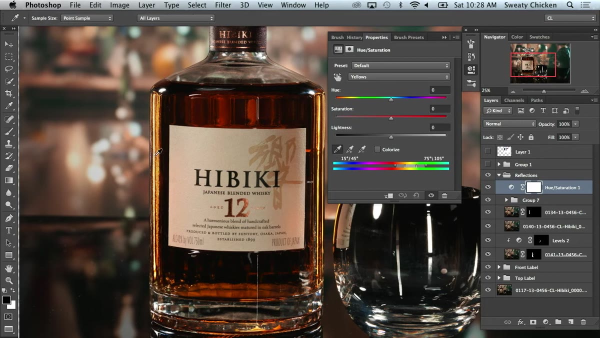 Hue/Saturation panel open with yellow channel selected
When you’re placing warm-toned highlights on both sides of a bottle, the cumulative effect can push the overall color toward yellow faster than you’d expect. Aaron solves this with a Hue/Saturation adjustment layer. Instead of pulling the saturation down (which kills intensity and makes the image look flat), he targets only the yellow channel and shifts the Hue slider slightly toward red. The highlight stays bright and punchy, but the sickly yellow cast disappears. Paint this correction in with a mask so it’s only affecting the areas where the color went wrong.
Hue/Saturation panel open with yellow channel selected
When you’re placing warm-toned highlights on both sides of a bottle, the cumulative effect can push the overall color toward yellow faster than you’d expect. Aaron solves this with a Hue/Saturation adjustment layer. Instead of pulling the saturation down (which kills intensity and makes the image look flat), he targets only the yellow channel and shifts the Hue slider slightly toward red. The highlight stays bright and punchy, but the sickly yellow cast disappears. Paint this correction in with a mask so it’s only affecting the areas where the color went wrong.
Step 7: Audit the Full Layer Stack
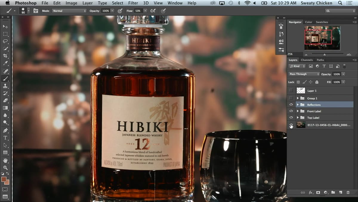 Layer panel visible with reflection and label layers organized
Before calling the retouch done, Option-click the eye icon on your background layer to isolate it and see exactly what the raw state of the image is. This is how Aaron catches a label layer that was accidentally covering part of the reflection. Comparing your starting point to your current state is not just a quality check. It’s how you figure out which of your layers are actually doing work and which ones are redundant. On a commercial retouch, I always do this before flattening. Stray layers cost clients real money in revision time.
Layer panel visible with reflection and label layers organized
Before calling the retouch done, Option-click the eye icon on your background layer to isolate it and see exactly what the raw state of the image is. This is how Aaron catches a label layer that was accidentally covering part of the reflection. Comparing your starting point to your current state is not just a quality check. It’s how you figure out which of your layers are actually doing work and which ones are redundant. On a commercial retouch, I always do this before flattening. Stray layers cost clients real money in revision time.
A Note on Asymmetry from My Own Practice
One thing I’d add to Aaron’s workflow: asymmetry in your highlights is almost always more convincing than symmetry, and this is especially true for bottles that will be photographed at a three-quarter angle. I have a client whose hot sauce line I shoot regularly, and when I first started adding artificial glints, I placed them evenly on both sides because it felt balanced. The result looked like clip art. Once I started varying the length, intensity, and falloff on each side independently, the images started reading like real objects under real light. The session Aaron demonstrates here shows this instinct clearly. He’s making compositional decisions about where the highlight should stop based on what else is in the frame. That kind of situational judgment is what separates a technical skill from a professional one.
The single most important idea in this entire tutorial is that blend modes do the heavy lifting, and masks do the refining. If you learn to trust Lighten and Screen modes as your starting point for any highlight work, you’ll spend less time fighting with opacity sliders and more time making creative calls about where light should fall. That shift in workflow alone has saved me hours on commercial jobs.
Watch the full tutorial on YouTube to see Aaron make these decisions in real time. The live back-and-forth with his collaborator is worth watching even if you know the techniques, because the conversation models how experienced retouchers think out loud about what looks right.