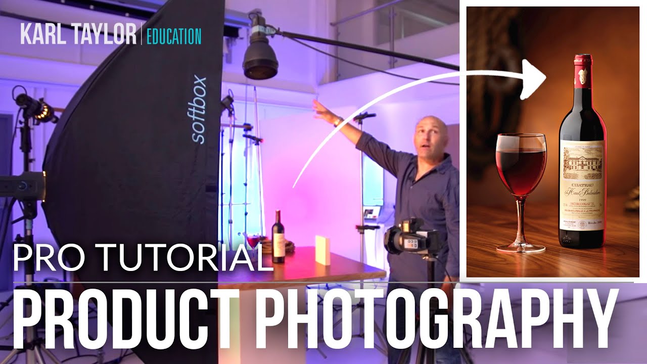
How a Pro Lights a Wine Bottle: Breaking Down Karl Taylor's 6-Light Setup Step by Step
There’s a category of product shot that stops you mid-scroll. The wine bottle with that warm, moody glow. The label crisp and readable. A whisper of red through dark glass that somehow reads as luxurious instead of just… brown. I’ve studied dozens of shots like that, tried to reverse-engineer them, and mostly landed on setups that were close but not quite there. The problem, I kept finding, was that I was thinking about lighting as one decision instead of six.
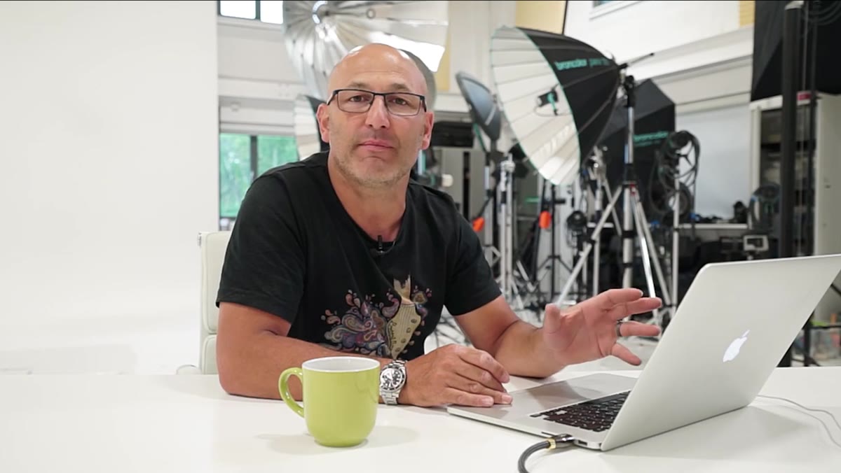
That changed when I watched Karl Taylor’s free wine bottle tutorial over at Visual Education. Watch the full tutorial on YouTube — it’s one of the most methodical lighting breakdowns I’ve seen, and it’s free. What makes it click is the build-up approach: Taylor switches on each light one at a time and shows you a frame after each addition. You stop guessing what’s doing what. You see it.
What follows is my breakdown of his technique, rewritten for practical use. Whether you’re shooting with strobes or speedlights, expensive broncolor heads or budget flashes, the logic here transfers. The principles are the real lesson.
Step 1: Build Your Set with Intention Before Touching a Light
 Wine bottle surrounded by walnut wood, rope, and leather props
Before any light goes on, Taylor has already made a dozen decisions about surface, texture, and color temperature. He’s working with a walnut wood surface, lengths of weathered rope, and a piece of leather as background elements. None of it is accidental. Every prop is warm-toned and natural, setting up a color story that the lights will later reinforce.
Wine bottle surrounded by walnut wood, rope, and leather props
Before any light goes on, Taylor has already made a dozen decisions about surface, texture, and color temperature. He’s working with a walnut wood surface, lengths of weathered rope, and a piece of leather as background elements. None of it is accidental. Every prop is warm-toned and natural, setting up a color story that the lights will later reinforce.
If you’re shooting products on a white sweep with no context, you’re starting a harder fight. The styling and the lighting need to agree. For a red wine bottle, warm and rustic reads authentic. Cold and clinical would undercut the product’s brand identity entirely. Figure out your color story first, then choose lights that support it.
Step 2: Establish Background Glow with a Gridded Reflector and Gel
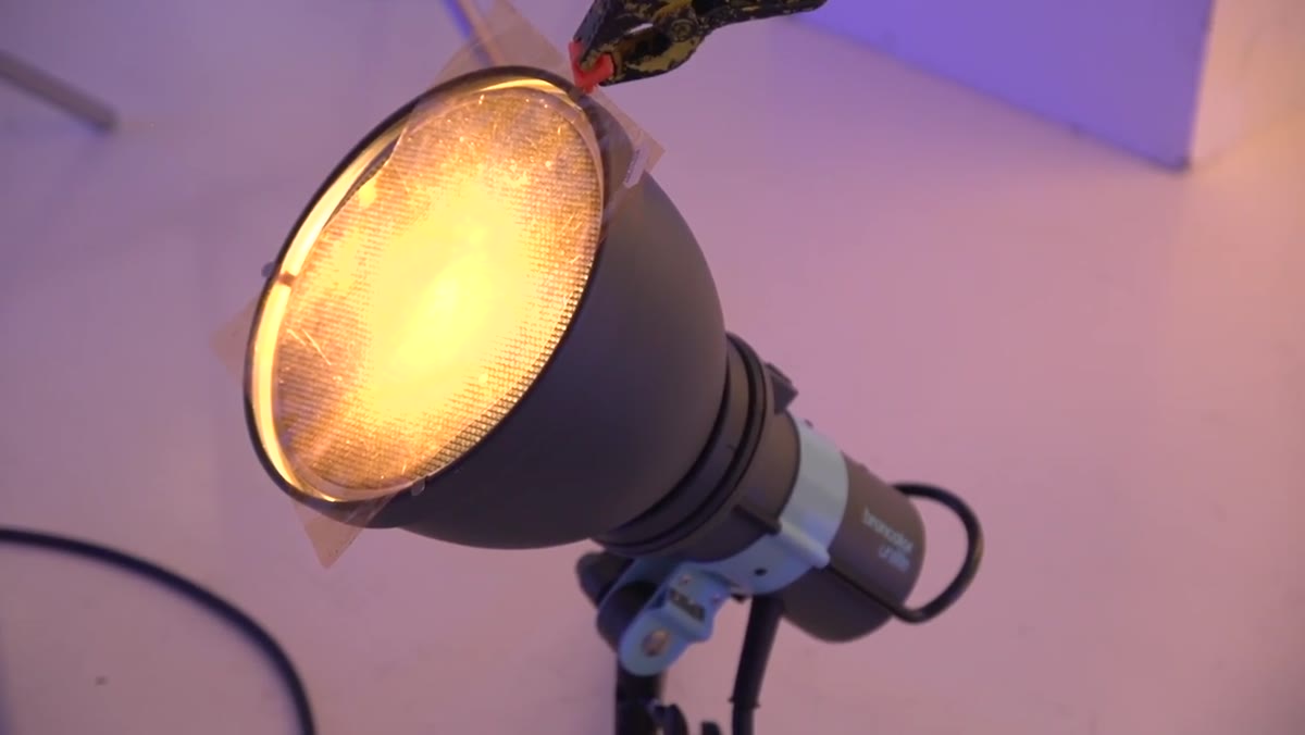 P-70 reflector with honeycomb grid casting warm glow behind bottle
The first light Taylor builds is the background — specifically a P-70 reflector fitted with a medium honeycomb grid and a subtle orange warming gel. The grid tightens the beam so the light grazes the background rather than flooding the entire frame. The gel shifts the color temperature toward amber, which layers warmth into the scene before the bottle is even properly lit.
P-70 reflector with honeycomb grid casting warm glow behind bottle
The first light Taylor builds is the background — specifically a P-70 reflector fitted with a medium honeycomb grid and a subtle orange warming gel. The grid tightens the beam so the light grazes the background rather than flooding the entire frame. The gel shifts the color temperature toward amber, which layers warmth into the scene before the bottle is even properly lit.
The takeaway here is control over spread. Without the grid, that same light would spill everywhere and flatten the depth of the image. The gel is subtle — Taylor describes it as “a slight warm-up,” not a full orange hit. If you’re using speedlights, a CTO warming gel cut to about half-strength gets you a similar effect. Take a test shot with only this light active. The background should glow without blasting.
Step 3: Add Accent Lights to Bring Texture Elements to Life
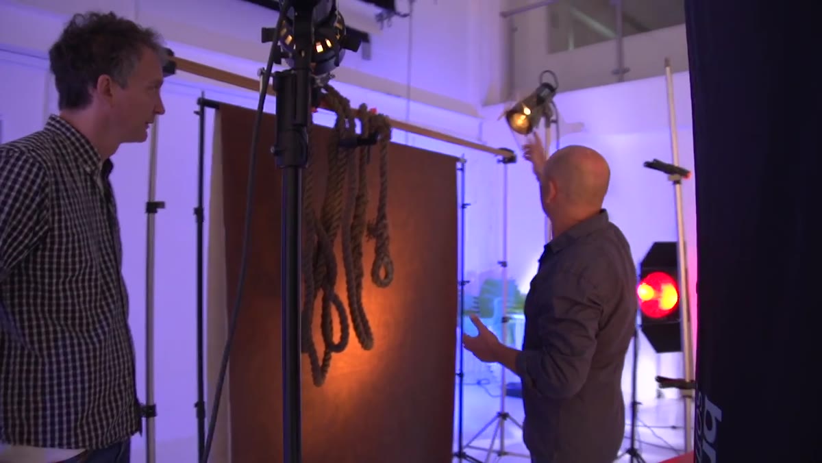 Pico light with Fresnel adapter aimed at background rope detail
Taylor uses two small Pico lights — one with a Fresnel adapter and a yellow gel, one with a projection attachment — to pick out the ropes hanging in the background. These elements are going to be heavily out of focus at f/3.2, so they don’t need to be perfectly lit. They just need enough light to register as warm, textured shapes that add depth behind the bottle.
Pico light with Fresnel adapter aimed at background rope detail
Taylor uses two small Pico lights — one with a Fresnel adapter and a yellow gel, one with a projection attachment — to pick out the ropes hanging in the background. These elements are going to be heavily out of focus at f/3.2, so they don’t need to be perfectly lit. They just need enough light to register as warm, textured shapes that add depth behind the bottle.
This is a move worth stealing for budget setups. You don’t need a dedicated Pico light — a small LED panel or even a gridded speedlight aimed at a background texture does the same job. The point is that your background shouldn’t be lit by accident, by whatever spills from your main light. Give it its own dedicated source, even a small one, and suddenly the image has visual layers.
Step 4: Solve the Red Wine Problem with a Red-Gelled Side Light
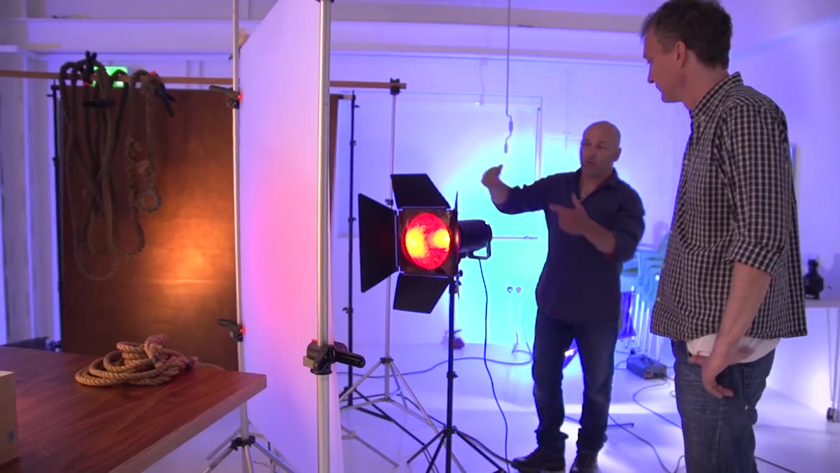 Red gel on Siros light aimed through diffusion material at bottle edge
Here’s the single most useful insight in the entire video: red wine looks black in photographs. The liquid absorbs so much light that even a wine bottle sitting in a beautiful, well-lit setup can look like a bottle of engine oil. Taylor solves this with a dedicated side light — a Siros strobe with a red gel, aimed through some diffusion material — that skims a thin line of red light down the edge of the bottle.
Red gel on Siros light aimed through diffusion material at bottle edge
Here’s the single most useful insight in the entire video: red wine looks black in photographs. The liquid absorbs so much light that even a wine bottle sitting in a beautiful, well-lit setup can look like a bottle of engine oil. Taylor solves this with a dedicated side light — a Siros strobe with a red gel, aimed through some diffusion material — that skims a thin line of red light down the edge of the bottle.
The diffusion material softens the beam so it’s not a hard stripe, just a warm suggestion of color. The effect is subtle in isolation but transformative in the final image. You see a hint of deep ruby in the glass, and your brain registers “wine” instead of “dark liquid.” For any dark-tinted glass product — wine, spirits, dark beer — this red-edge trick is something you should have in your toolkit permanently.
Step 5: Bring in the Main Softbox and Manage Its Reflections
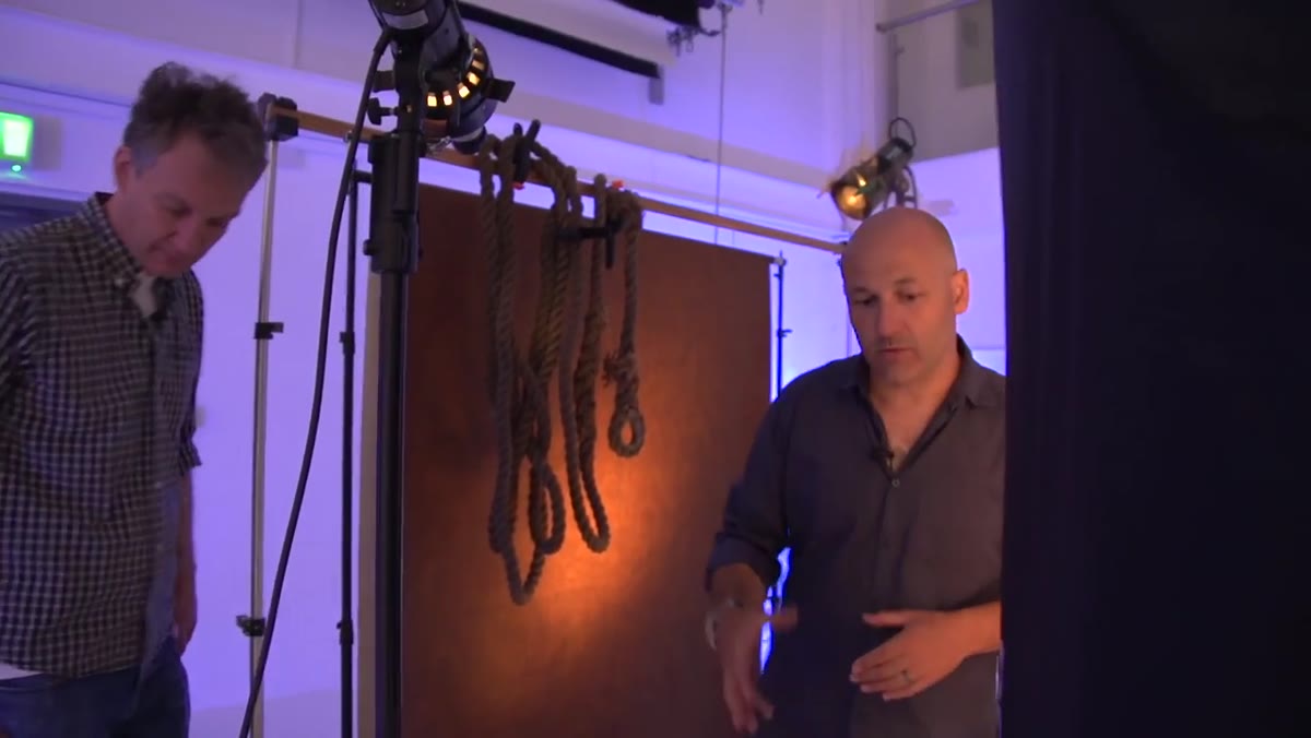 120x80cm softbox positioned as main light on bottle and label
The primary light is a 120x80cm softbox, positioned to illuminate both the bottle and the label. At this size, it wraps nicely around the bottle’s curved surface — but Taylor flags a common problem immediately: a large softbox creates a very defined, hard-edged reflection stripe on glass. Whether that’s desirable depends on the look you’re after. A sharp edge reflection reads more commercial and graphic. A softer, more diffused reflection reads more editorial and moody.
120x80cm softbox positioned as main light on bottle and label
The primary light is a 120x80cm softbox, positioned to illuminate both the bottle and the label. At this size, it wraps nicely around the bottle’s curved surface — but Taylor flags a common problem immediately: a large softbox creates a very defined, hard-edged reflection stripe on glass. Whether that’s desirable depends on the look you’re after. A sharp edge reflection reads more commercial and graphic. A softer, more diffused reflection reads more editorial and moody.
If you don’t love the edge the softbox gives you, adding an extra layer of diffusion material in front of it — a piece of ripstop nylon or even a shower curtain — softens the reflection on the glass without cutting much overall power. Pay attention to where that softbox reflection hits the label too. The label needs to be readable and evenly lit, which brings us to the next step.
Step 6: Use a Small Reflector to Fill the Label Shadow Without Adding Glass Reflections
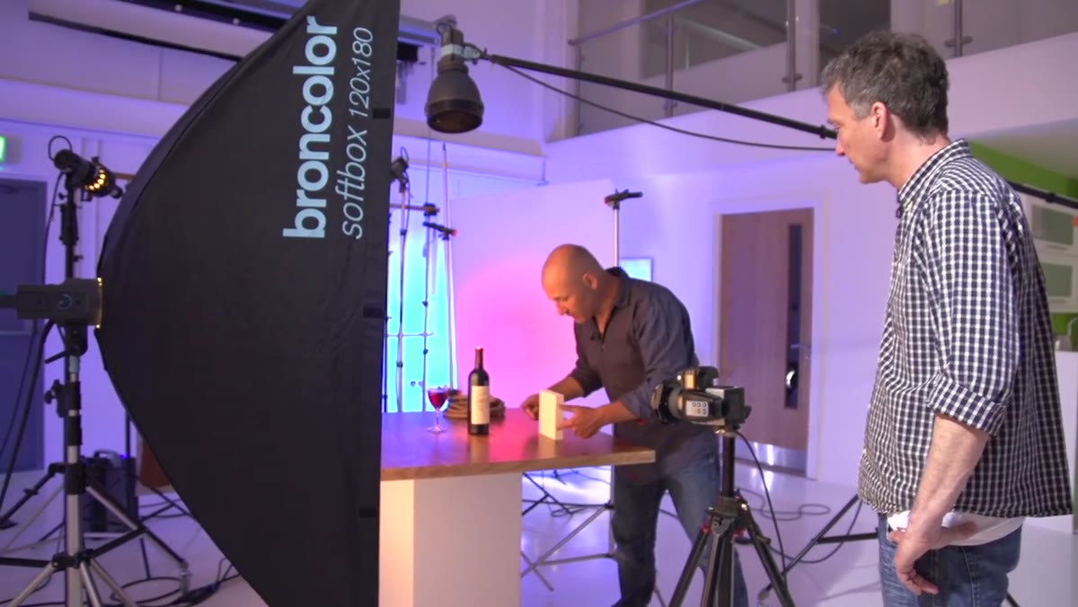 Small white block of wood used as reflector on shadow side of label
To lift the shadow side of the label, Taylor places a small block of wood with a white surface right next to the bottle. It bounces some of the main softbox light back into the darker side of the label. The crucial detail is the size: small enough to fill only the label area, not the bottle surface above it.
Small white block of wood used as reflector on shadow side of label
To lift the shadow side of the label, Taylor places a small block of wood with a white surface right next to the bottle. It bounces some of the main softbox light back into the darker side of the label. The crucial detail is the size: small enough to fill only the label area, not the bottle surface above it.
If he used a full-height reflector here, he’d introduce another unwanted highlight streak on the glass. The controlled size of the reflector is the whole point. You can replicate this with a folded white card cut to about label height. Test it by moving it in and out of frame while watching your live view or tethered capture. When the label looks balanced without a new highlight appearing on the bottle, you’ve found your position.
Step 7: Add a Top Light for Vignette and Atmosphere
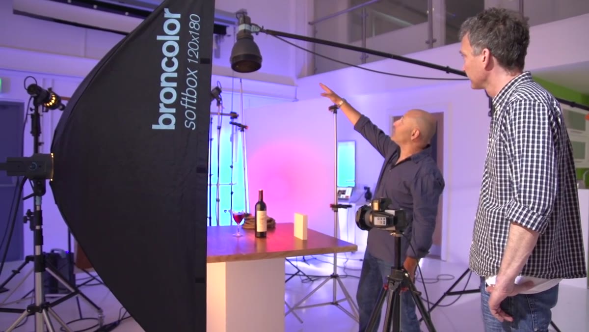 P-70 with tight honeycomb grid overhead creating pool of light on bottle
The final light is a P-70 reflector with a very tight honeycomb grid, placed overhead to cast a focused pool of light directly onto the bottle. This creates a natural vignette — the edges of the frame fall into shadow while the subject stays bright. It’s a way of using light to compose the image, pulling the viewer’s eye toward the product without any post-processing tricks.
P-70 with tight honeycomb grid overhead creating pool of light on bottle
The final light is a P-70 reflector with a very tight honeycomb grid, placed overhead to cast a focused pool of light directly onto the bottle. This creates a natural vignette — the edges of the frame fall into shadow while the subject stays bright. It’s a way of using light to compose the image, pulling the viewer’s eye toward the product without any post-processing tricks.
A tight-gridded speedlight works perfectly for this. Place it high, angle it down, and dial the power until the pool of light is just wide enough to cover the bottle. Check your corners. They should be noticeably darker than the center of the frame.
What I’d Do Differently on a Smaller Budget
I don’t shoot with broncolor. Most of my clients are small business owners, and my studio runs on speedlights and a couple of LED panels. The thing about Taylor’s setup is that none of the techniques require his specific gear — they require his thinking.
The build-up method is the biggest thing I’ve taken from this tutorial and applied directly. I now turn on every light one at a time, shoot a frame, and evaluate what each source is contributing. I started doing this after photographing products for a jewelry client and realizing three of my five lights were fighting each other. Eliminating lights one by one helped me see what was actually needed. Sometimes you get a better image with two lights and clear intent than five lights and vague hope.
The single most important thing this tutorial teaches isn’t any individual light placement. It’s that a great product photograph is a series of small, deliberate decisions stacked on top of each other. Background glow, accent texture, edge color, main exposure, label fill, vignette — each one a separate problem with a separate solution. Solve them in order, and the final image almost builds itself.
Watch the full tutorial on YouTube to see every light firing in real time, and pay close attention to how different the image looks between each step. That visual comparison is the real education.