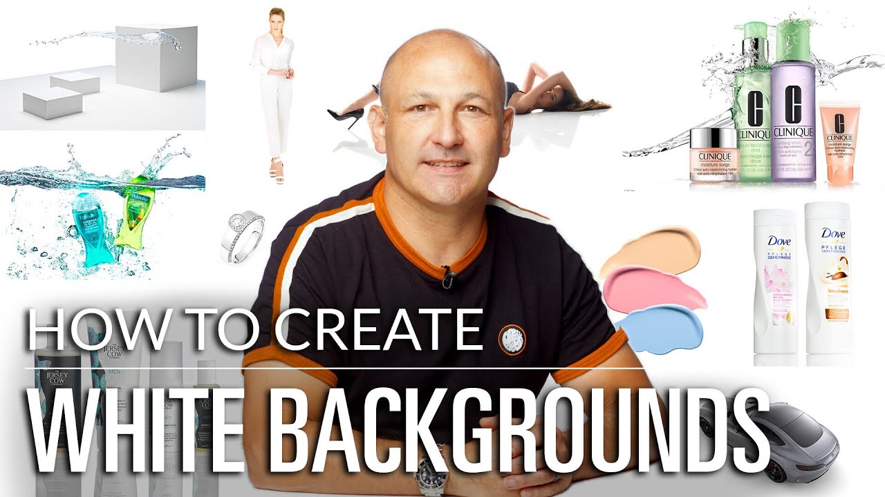
Getting True White Backgrounds Right: What the Tutorials Don't Tell You (But This One Does)
I used to think white background photography was the easy part. Set up a white surface, point some lights at it, done. Then I started shooting products for real clients and realized just how many ways that deceptively simple setup can fall apart. The background goes gray. The subject looks washed out. The whole image feels flat and unconvincing, which is a problem when your client is trying to sell something.
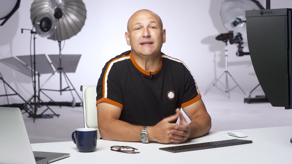
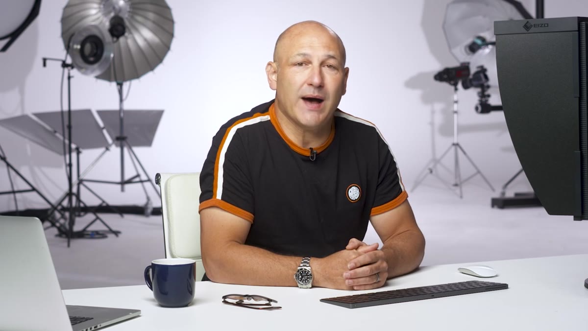
That’s exactly why I keep coming back to this Visual Education tutorial on white background photography. Watch the full tutorial on YouTube - it covers considerations, equipment, and three practical lighting setups in a way that’s genuinely useful whether you’re shooting in a commercial studio or your spare bedroom. What follows is my own walkthrough of the core lessons, with some notes from how I apply them day-to-day.
The core tension in white background photography is this: you need the background to read as pure white, but too much light trying to achieve that will bounce back into your lens and destroy the subject. Getting that balance right is less about expensive gear and more about understanding a few key principles. Here’s how the tutorial walks through them.
Step 1: Start by Evaluating Your Product and Whether White Is Even Right
 Photographer considering product placement and background choice
Before you touch a light, think about the product itself. White backgrounds are the standard for e-commerce, but they’re not automatically the best choice for every product. The goal is to show the item clearly and highlight its key features, so you need to ask what angle tells the most honest and compelling story about it. A transparent glass bottle needs different treatment than a matte ceramic mug. A product with a lot of white or light-toned details might actually disappear against a pure white background.
Photographer considering product placement and background choice
Before you touch a light, think about the product itself. White backgrounds are the standard for e-commerce, but they’re not automatically the best choice for every product. The goal is to show the item clearly and highlight its key features, so you need to ask what angle tells the most honest and compelling story about it. A transparent glass bottle needs different treatment than a matte ceramic mug. A product with a lot of white or light-toned details might actually disappear against a pure white background.
Your shooting angle, lens choice, and camera settings all follow from the product, not from a preset formula. I shoot a lot of jewelry and small goods, and I’ve learned to spend five minutes just holding the product and rotating it before I set anything up. That thinking time saves me from lighting decisions I’d have to undo later.
Step 2: Choose the Right Background Surface for Your Setup
 White acrylic sheet and paper roll backdrops shown side by side
The surface you shoot on shapes the final image more than most photographers expect. The tutorial highlights a few solid options: white walls, white acrylic (both matte and gloss), paper rolls, and MDF or wooden boards. Each one gives you a different quality of reflection and edge. Gloss acrylic creates a subtle mirror-like reflection beneath the product, which works beautifully for cosmetics and packaged goods. Matte acrylic or paper gives you a cleaner, more neutral result.
White acrylic sheet and paper roll backdrops shown side by side
The surface you shoot on shapes the final image more than most photographers expect. The tutorial highlights a few solid options: white walls, white acrylic (both matte and gloss), paper rolls, and MDF or wooden boards. Each one gives you a different quality of reflection and edge. Gloss acrylic creates a subtle mirror-like reflection beneath the product, which works beautifully for cosmetics and packaged goods. Matte acrylic or paper gives you a cleaner, more neutral result.
I keep both matte and gloss acrylic sheets in my kit and choose based on what the client’s brand calls for. Gloss reads as premium and modern. Matte reads as clean and editorial. Neither is better in general - only better for a specific product and purpose.
Step 3: Plan Your Studio Space Before You Place a Single Light
 Small studio setup showing distance between subject and background
Studio size is a real constraint, but it’s a workable one. The key insight here is about distance. You need space between your subject and your background, and you need space between the background and the light that’s hitting it. When a background light is placed too close to the surface, the spread of light is narrow and uneven. You’ll get a hot spot in the center and a gradual fall-off toward the edges, which reads as gray on camera even if it looks bright to your eye.
Small studio setup showing distance between subject and background
Studio size is a real constraint, but it’s a workable one. The key insight here is about distance. You need space between your subject and your background, and you need space between the background and the light that’s hitting it. When a background light is placed too close to the surface, the spread of light is narrow and uneven. You’ll get a hot spot in the center and a gradual fall-off toward the edges, which reads as gray on camera even if it looks bright to your eye.
If your space is tight, you may only be able to use one light on the background, so placement and modifier choice become even more critical. If you have room to spread out, two lights flanking the background at equal distances and equal power will give you a much more even, reliable white.
Step 4: Match Your Lighting Modifiers to Your Space and Subject Size
 Octa boxes and wide-angle reflectors positioned behind subject
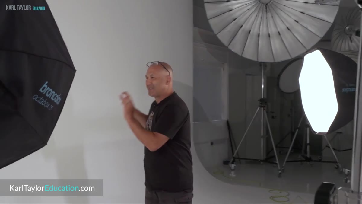
Modifier choice isn’t just an aesthetic decision - it’s a practical one based on how much background needs to be illuminated and how large the shooting area is. For small products in tight spaces, a single light with a standard reflector can sometimes be enough. For larger setups or wider products where more background is visible in frame, small octa boxes or wide-angle reflectors help distribute light more evenly across the surface.
Octa boxes and wide-angle reflectors positioned behind subject
Modifier choice isn’t just an aesthetic decision - it’s a practical one based on how much background needs to be illuminated and how large the shooting area is. For small products in tight spaces, a single light with a standard reflector can sometimes be enough. For larger setups or wider products where more background is visible in frame, small octa boxes or wide-angle reflectors help distribute light more evenly across the surface.
The principle is simple: the wider the area you need to illuminate, the more you need to spread the light. A bare reflector pointed at the center of a background will light the center well and let the edges fall gray. A wide-angle reflector or octa box pushes light out at a broader angle and minimizes that fall-off. I’ve found that two lights with small octa boxes at roughly 45 degrees to the background, one on each side, is the most reliable setup for even backgrounds across a range of product sizes.
Step 5: Diagnose and Prevent Lens Flare from Background Blowout
 Washed-out product image showing flare caused by overlit background
This is the mistake that catches a lot of photographers who are new to white background work. When you push the background lights hard enough to blow the white out, you create a surface that’s essentially a large reflector pointed back at your lens. The result is that the subject looks lighter, softer, and lower in contrast than it actually is. It’s a subtle problem that’s hard to diagnose on a small camera screen but very obvious on a monitor or when a client sees the final files.
Washed-out product image showing flare caused by overlit background
This is the mistake that catches a lot of photographers who are new to white background work. When you push the background lights hard enough to blow the white out, you create a surface that’s essentially a large reflector pointed back at your lens. The result is that the subject looks lighter, softer, and lower in contrast than it actually is. It’s a subtle problem that’s hard to diagnose on a small camera screen but very obvious on a monitor or when a client sees the final files.
The fix involves controlling the angle and direction of your background lights so they can’t bounce directly back into the lens, and using flags or masks to cut that reflected light when needed. A flag doesn’t have to be a professional piece of kit - I’ve used black foam board taped to a light stand more times than I can count. The goal is to physically block the stray light from reaching the lens while keeping the background evenly lit.
What I’d Add From My Own Shoots
The tutorial gives you the foundations, and they’re solid. The thing I’d layer on top is this: meter the background separately from the subject, always. I use a handheld incident light meter at the background surface and again at the subject position. For a clean white background that doesn’t flare the subject, I aim for the background to read about one to one-and-a-half stops brighter than the subject exposure. Any more than that and you start to see that washed-out flare effect creeping into the subject. Any less and the background photographs as a dull off-white or light gray.
When I helped my mom rework the product photos for her jewelry business, this one adjustment - dialing the background exposure to just one stop over the subject rather than blasting it as bright as possible - was the single biggest factor in making the images look professional. The products stayed crisp and saturated. The background went clean white. It’s a small calibration that makes a significant difference.
The most important thing to take away from this tutorial is that white backgrounds are a lighting problem, not a post-processing problem. Chasing a clean white in Lightroom or Photoshop after the fact is a slower and messier fix than getting the exposure relationship right in camera. Once you understand the distance, modifier, and flare variables at play, you have real control over the result rather than hoping the edit saves you.
Watch the full tutorial on YouTube to see all three lighting setups demonstrated with the actual gear in use. The visual walkthroughs of each configuration make the spatial relationships much easier to understand than any description can.