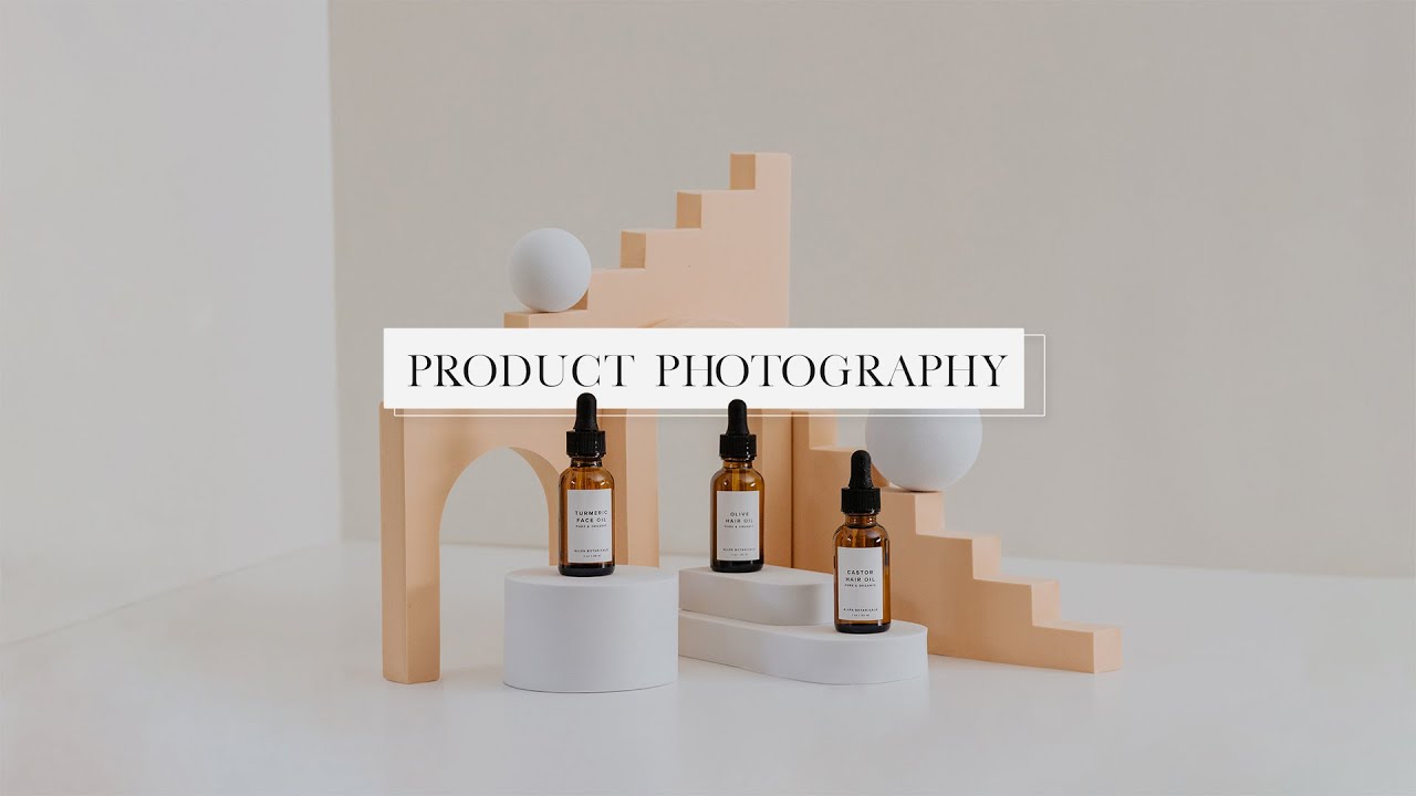
Build a Better Product Shot: 10 Techniques I Learned from Mango Street's Shoot
When a friend’s Etsy shop closed after two years, I went back and looked at her listings. The products were genuinely good. The prices were fair. But the photos looked like accident scenes, flat light, cluttered backgrounds, and angles that hid the best features of every item. That experience is a big part of why I now teach shooting basics to small business owners, and why I keep a running list of tutorials I send to people who are just starting out. Watch the full tutorial on YouTube
In this Mango Street tutorial, the duo takes on a real client shoot for a botanical oils brand called Alpha Botanicals. What makes this one worth studying is the constraint: they’re working without their full kit. No seamless paper, no C-stands, no full lens collection. Watching professionals problem-solve in real time teaches you more than a perfectly staged demo ever could. Here’s how I’d walk a student through what they do.
Step 1: Build a Clean, Minimal Background from What You Have
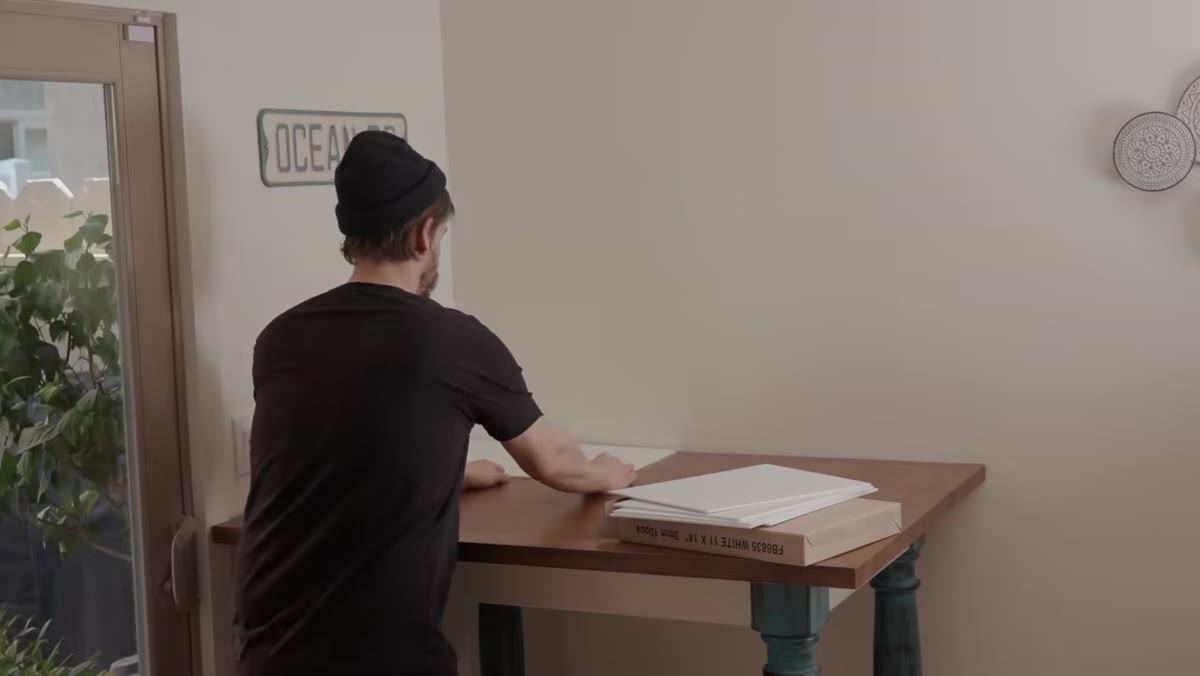 Foam core pieces arranged as floor and wall backdrop
You do not need a seamless paper roll to get a clean, studio-style background. In the tutorial, the team pushes a table against a white wall and lays white foam core sheets flat across the table surface to simulate that curved cyclorama look. The goal is a continuous white field with no visible horizon line between the floor and wall.
Foam core pieces arranged as floor and wall backdrop
You do not need a seamless paper roll to get a clean, studio-style background. In the tutorial, the team pushes a table against a white wall and lays white foam core sheets flat across the table surface to simulate that curved cyclorama look. The goal is a continuous white field with no visible horizon line between the floor and wall.
The honest caveat they acknowledge: foam core seams cast thin shadow lines that you end up fixing in post. The lesson is not that foam core is perfect. It is that a usable background is better than a perfect background you do not have. If you shoot in a kitchen or spare bedroom, a large white foam core sheet from any art supply store ($3 to $5) gets you 80% of the way there.
Step 2: Plan Your Sets Before You Pick Up the Camera
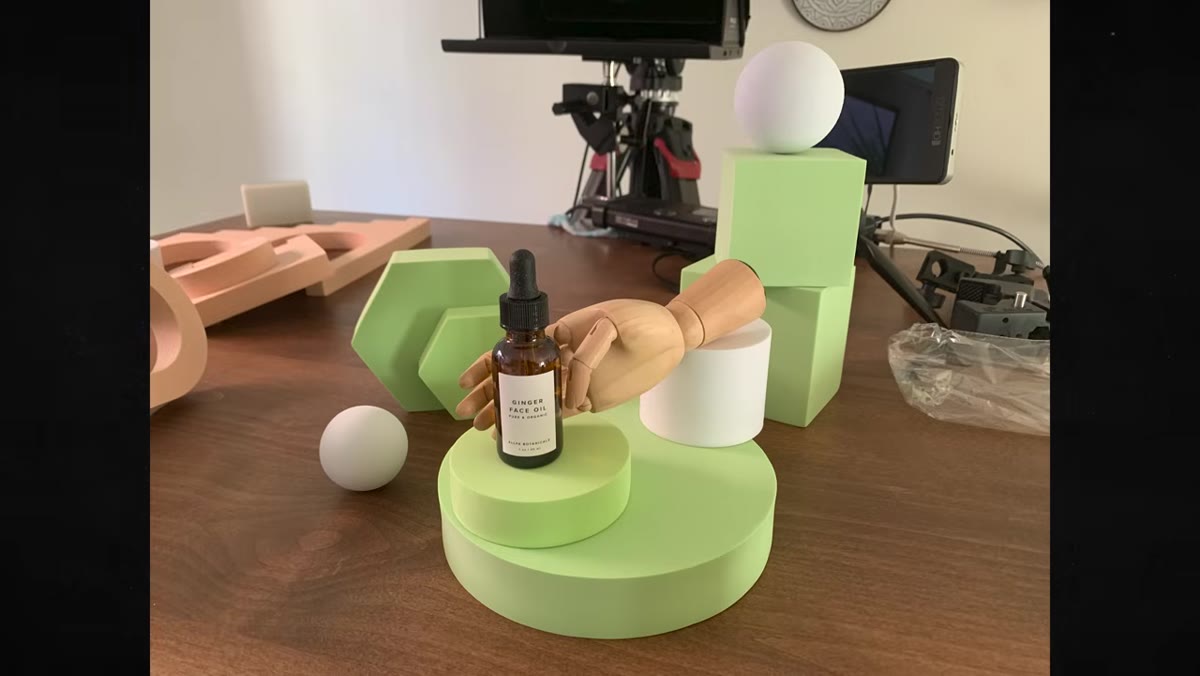 Phone screen showing test compositions photographed in advance
This is the step most beginners skip and most professionals swear by. Before the actual shoot, the team arranges different prop-and-product combinations and photographs them on a phone. Those phone snapshots become reference images during the real shoot.
Phone screen showing test compositions photographed in advance
This is the step most beginners skip and most professionals swear by. Before the actual shoot, the team arranges different prop-and-product combinations and photographs them on a phone. Those phone snapshots become reference images during the real shoot.
There is a second reason to do this that they mention and I think deserves more emphasis: roughly half of e-commerce shoppers are browsing on a phone screen. Composing your test shots on a phone forces you to see the frame the way your buyer sees it. Build a mix of landscape and portrait orientations, but weight your ratio toward portrait. Vertical frames scroll better, fill more screen real estate, and tend to perform better in mobile storefronts and social ads.
Step 3: Choose a Color Palette That Works With the Product
 Props in pastel orange, green, and white arranged around product bottles
Color choices in props are not decorative. They are strategic. The team selects pastel orange, soft green, and white because those colors do specific jobs. The orange echoes the amber tones in the oil bottles. The green signals natural and botanical. The white keeps the scene from feeling busy.
Props in pastel orange, green, and white arranged around product bottles
Color choices in props are not decorative. They are strategic. The team selects pastel orange, soft green, and white because those colors do specific jobs. The orange echoes the amber tones in the oil bottles. The green signals natural and botanical. The white keeps the scene from feeling busy.
If you are shooting for an existing brand, pull colors directly from the logo or packaging. This is one of the fastest ways to make a set feel cohesive and professional, and clients respond to it immediately because it feels intentional rather than assembled at random. Avoid highly saturated prop colors unless the product itself is bold. Saturated props compete with the product instead of supporting it.
Step 4: Use Odd Numbers When Grouping Products or Props
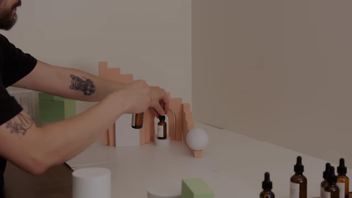 Three products arranged together in a single composition
This is one of those rules of visual design that sounds arbitrary until you start testing it. Groupings of three tend to look more balanced and dynamic than groupings of two or four. Two items feel like a pair and flatten the composition. Four items often create a symmetrical grid that reads as static.
Three products arranged together in a single composition
This is one of those rules of visual design that sounds arbitrary until you start testing it. Groupings of three tend to look more balanced and dynamic than groupings of two or four. Two items feel like a pair and flatten the composition. Four items often create a symmetrical grid that reads as static.
Start with three as your default when you are grouping products together or arranging supporting props around a hero item. You can break this rule once you understand why it works, but when you are struggling with a composition that feels off and you cannot identify why, count your elements. Odds are the number is even.
Step 5: Build Depth Into Your Set
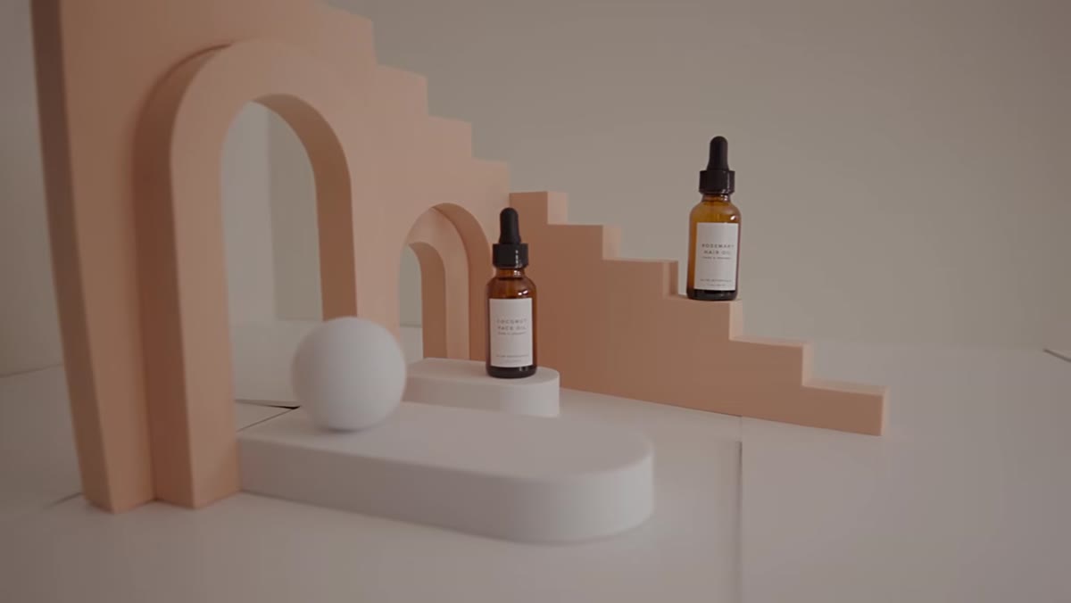
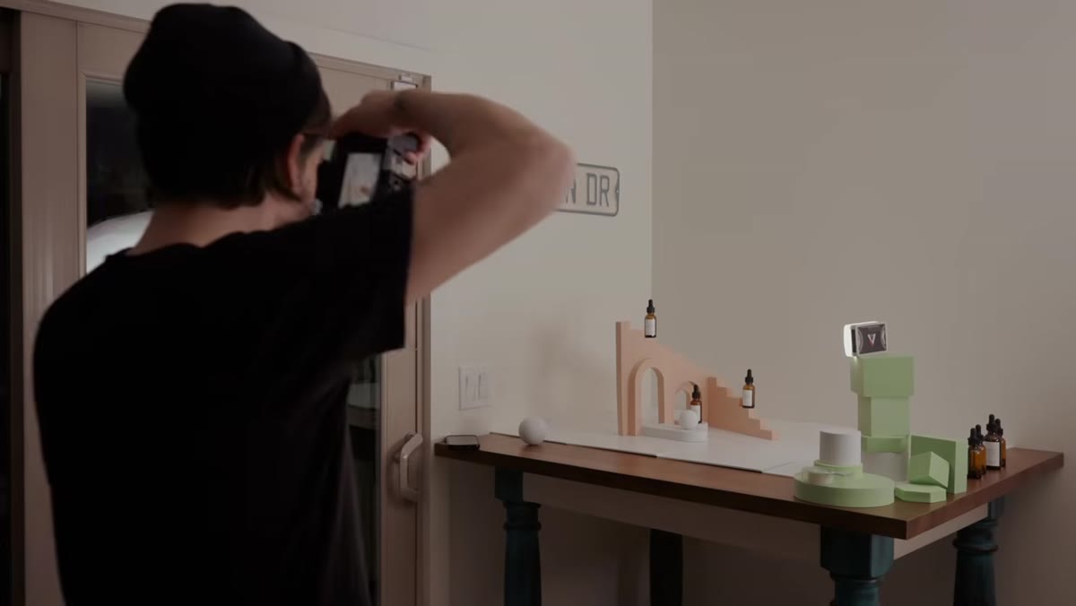 Arch props placed in front and behind product to create layered depth
A flat arrangement of products on a flat surface produces a flat photo. The team adds visual depth by placing props at different distances from the camera, specifically arch-shaped foam forms both in front of and behind the main product. When the camera focuses on the product in the middle ground, the foreground and background elements soften into a shallow depth of field, and the image immediately feels more dimensional.
Arch props placed in front and behind product to create layered depth
A flat arrangement of products on a flat surface produces a flat photo. The team adds visual depth by placing props at different distances from the camera, specifically arch-shaped foam forms both in front of and behind the main product. When the camera focuses on the product in the middle ground, the foreground and background elements soften into a shallow depth of field, and the image immediately feels more dimensional.
You can create this effect with almost anything: a small plant behind the product, a textured swatch of fabric in the foreground, a second prop slightly out of focus to one side. The point is to give the eye multiple planes to move through rather than one flat surface to land on.
Step 6: Add Texture to Reinforce the Product’s Story
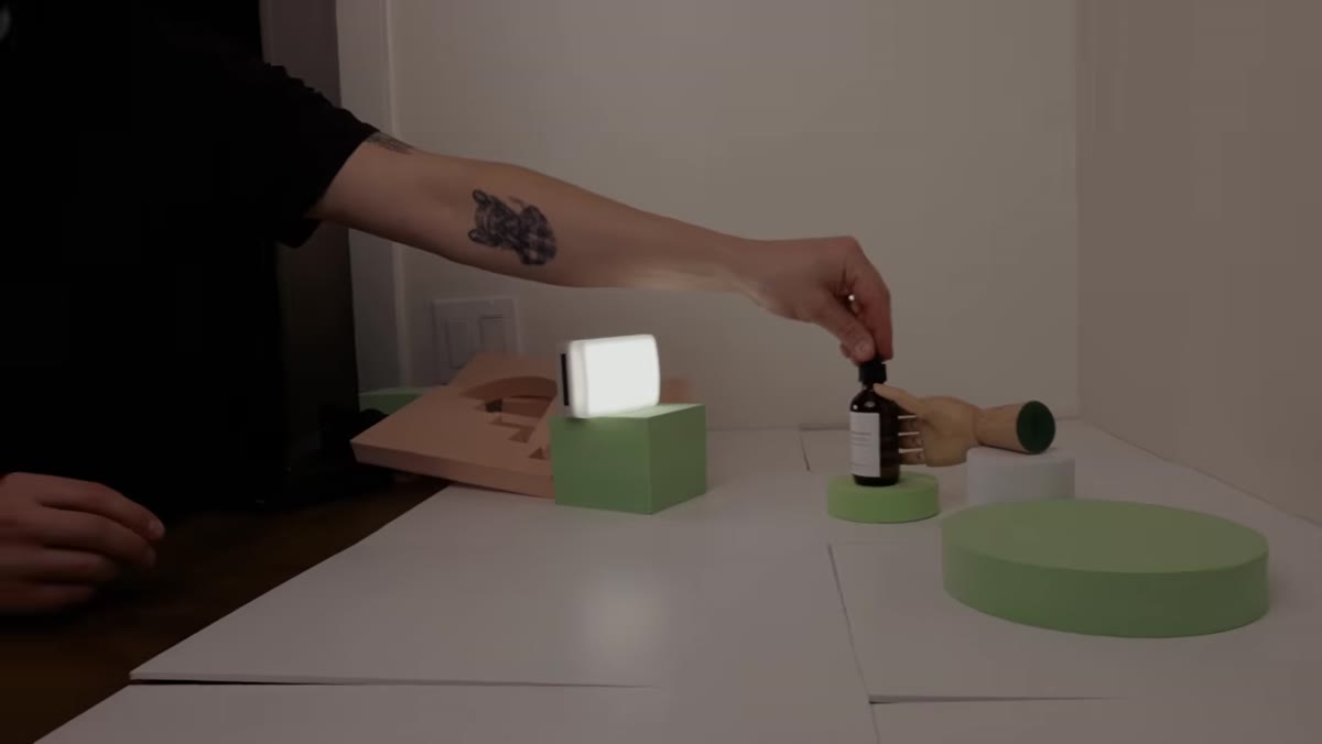 Wooden hand prop introduced next to clean geometric foam props
Texture does a job that color alone cannot do. In the tutorial, the team introduces a wooden hand prop among their clean geometric forms. The wood grain adds warmth and a natural, handmade quality that reinforces the botanical brand identity without needing any text or explanation.
Wooden hand prop introduced next to clean geometric foam props
Texture does a job that color alone cannot do. In the tutorial, the team introduces a wooden hand prop among their clean geometric forms. The wood grain adds warmth and a natural, handmade quality that reinforces the botanical brand identity without needing any text or explanation.
Think about what your product implies. Skincare implies nature, softness, or science. A leather wallet implies craftsmanship. A tech accessory implies precision. Find one textural element that speaks to that implication and introduce it as a supporting character in the frame. One well-chosen texture beats a dozen mismatched props.
Step 7: Vary the Height of Your Elements
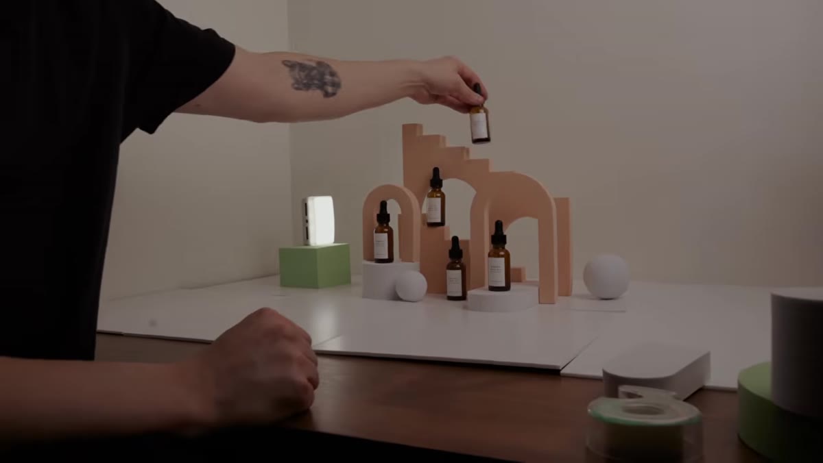 Props at different heights creating visual layers within the composition
Height variation is one of the most underused tools in tabletop product photography. When every element sits flat on the same surface, the composition reads as two-dimensional regardless of how good your lighting is. Elevating one product on a small riser, stack of books, or foam block creates an immediate hierarchy and gives the eye a clear entry point.
Props at different heights creating visual layers within the composition
Height variation is one of the most underused tools in tabletop product photography. When every element sits flat on the same surface, the composition reads as two-dimensional regardless of how good your lighting is. Elevating one product on a small riser, stack of books, or foam block creates an immediate hierarchy and gives the eye a clear entry point.
The tutorial team uses varying-height props throughout their setups. Even a two-inch difference between the tallest and shortest element in a frame is enough to create visual rhythm. This technique also helps when you need to direct the viewer’s attention to a specific product in a multi-item shot.
What I’d Add from My Own Experience
The tutorial covers set design and composition thoroughly, but there is one thing I would layer on for anyone shooting e-commerce specifically: shoot every hero product in isolation against a clean white background before you do anything styled. Retailers often require a pure white background image for marketplace listings (Amazon enforces this strictly), and it is much easier to capture that version when the product is already out and your light is set up. Style shots are for social media, ads, and brand pages. The clean isolation shot is for conversion. You need both, and getting both in one session saves significant time.
The single most important idea in this tutorial is the one about pre-planning your sets on your phone before the real shoot starts. Everything else, color, depth, texture, height, works better when you have thought it through before the camera comes out. That one habit alone separates photographers who finish a shoot with usable selects from those who finish with a hard drive full of problems. Watch the full tutorial on YouTube and pay close attention to how the team evaluates and adjusts setups in real time. That instinct is what the tips are actually teaching.